As the artform of cinema continues to evolve, and the business of it continues to devolve, it becomes more and more important to recognize the achievements of talented professionals and the definition of words. The Oscar for Production Design is the only one that’s technically awarded to two different parties with separate job titles – the Production Designer and the Set Decorator. This is because the prize itself is given for the overall look of the sets and interiors of a film.
However, given current trends, this may be a dying trade. More and more blockbuster films – particularly superhero and science fiction fare – are done against green screens and CGI projections without any actual sets. And somehow, one of last year’s nominees in this field – Avatar: The Way of Water – fell into this group. I’m sure there’s some Bake-Off distinction and Academy rule that allows it, but when I saw that it was nominated, my immediate thought was that it should be disqualified because there were no SETS for the SET DECORATOR to DECORATE! I’m sure the nominee came up with some interesting designs and ideas, but clicking a digital asset and moving it from one side of the screen to the other isn’t set decoration by any reasonable definition.
As much press as the actors and writers got last year for their strikes to prevent A.I. replacement, not much attention was given to these below-the-line workers. As digital scenery plays a larger role in movies, more and more hard-working people are left by the wayside. Every underpaid VFX artist tasked with creating an entire set on his computer means about 20 construction workers, electricians, and other technicians (most of them union) now out of a job because they can’t build anything. They aren’t as flashy or media-friendly, but they’re just as important.
So as we delve into this year’s contest, let us spare a thought for the massive teams of people who not only won’t win an Oscar for their efforts, but unless shit gets fixed but fast, this entire discipline may be rendered obsolete.
This year’s nominees for Production Design are…
Barbie – Production Design by Sarah Greenwood; Set Decoration by Katie Spencer
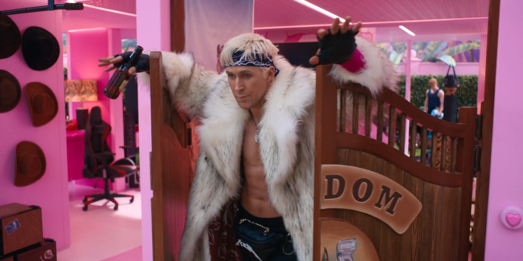
One of the most distinctive features of the Barbie movie is the living playset that is Barbie Land. It’s bright, imaginative, and completely covered in a plastic sheen that really makes it feel like an oversized toy chest. Not only did a crazy amount of detail go into making this place a reality, but as Greenwood herself noted to Architecture Digest, the vision was so specific and so massive that the production temporarily exhausted the global supply of fluorescent pink paint. I mean, how is that even possible? Here I am marveling at how much Weird Barbie’s place looks like Pee-wee’s Playhouse, and it turns out the need for vibrant color was so great that it actually took all the pink available for a time.
Outside the major set piece, the other locations are highly creative as well. Mattel headquarters is a delightfully silly mix of corporate homogeny and a fun house maze, complete with an anachronistic apartment for the ghost of Ruth Handler. The Venice Boardwalk looks just like it does in real life, filled to the brim with niche shops, street performers, surfers, and dude-bros. As I learned while working a local election at a middle school, a lot of Los Angeles schools really do have outdoor cafeterias, so even Barbie’s initial meeting with Sasha is accurate.
Perhaps most surprising and impressive of all is the use of empty space. During the “I’m Just Ken” number and Barbie’s pivotal decision to become human, there are scenes that simply exist in empty rooms, devoid of props but lit perfectly for mood and effective pathos. Even when everything is stripped away, the design element is as close to perfect as can be for what this film was going for. Even if you’re not a fan of Barbie, you have to admire what was accomplished here.
Killers of the Flower Moon – Production Design by Jack Fisk; Set Decoration by Adam Willis

The design elements of Killers of the Flower Moon succeed on two major fronts. The first is in establishing the dichotomy between William Hale’s privileged existence and the compartmentalized life of the Osage. This is done through an excellent use of economy of space. In a visual metaphor for how white America marginalized indigenous people (and still does), Hale delights in excess and waste. He casually tosses books aside in his parlor. He enjoys a shave at a barber shop with a large open floor. He has an entire room immaculately painted in black and white just for paddling Ernest.
Meanwhile, despite their riches due to the oil fields, the Osage live in very cramped quarters. A dozen or so people filter in and out of tiny, one-floor houses on the reservation. Several social events, including weddings and funerals, are forced outside due to a lack of accommodations. Even when Ernest and Mollie buy a house on a residential street, the stairways are narrow and the rooms packed with belongings, all efficiently stored, but leaving minimal room for movement. It’s a great way to convey the idea that even when they’re financially well-off, they’re still confined into tight spaces while lethargic whites bask in vast amounts of land and space.
Outside of that grand context, the sets serve as a time capsule for 1920s Oklahoma. The storefronts, cars, farming equipment, dirt roads, spartan prison spaces, it all comes together to maintain the feel of living a century ago without leaving your seat. Nothing feels artificial or tacked on. From the moment the train pulls into Fairfax and Ernest gets off, you as the viewer are immersed in this environment in a way that feels completely natural.
Napoleon – Production Design by Arthur Max; Set Decoration by Elli Griff

For the most part, Napoleon‘s design is an exercise in opulence, a visual contrast to the anti-bourgeois revolutionary spirit that took down Louis XVI and Marie Antoinette. It’s one of the few plusses in the film’s favor that after the opening scene where the former queen is beheaded while wearing rags and having produce thrown at her (the executioner playfully dangling her head like a tether ball also makes for great prop use), there’s never a missed opportunity to show its characters wallowing in their accumulated and ill-gotten wealth. Hell, one of the nobles is even arrested while partaking in a lavish breakfast that would be a feast for any of us, even fat asses like me.
Every palatial hallway and room is bombastically appointed, nearly every square inch of floor and wall covered in some glamorous objet d’art. Josephine seduces Napoleon while sitting on porcelain chairs and large, fluffy sofas. The throne room is awash in jewels, artwork, and high-class ornamentation. Even the country house where Josephine lives after the divorce, which is supposed to be a step back for her in terms of lifestyle, is still a mansion.
The thing is, none of this is all that impressive, because it’s all been done before. Take any period piece about wealthy people and royals, and you’ll find the same stuff. It’s old hat at this point. Where the design distinguishes itself is in the military aspect. The battlefields are damn near pristine, laying out the dimensions like a living map, so that we in the audience get a sense of Napoleon’s then-novel tactics. Even when he’s defeated, the brig area on Wellington’s ship, where Napoleon brags about his exploits to the young midshipmen despite being their prisoner, is kind of a warped masterpiece, as the floor and windows are oddly tilted so that he looks like he can almost rise to eye level with his captor despite sitting down. It’s a great touch.
Oppenheimer – Production Design by Ruth De Jong; Set Decoration by Claire Kaufman
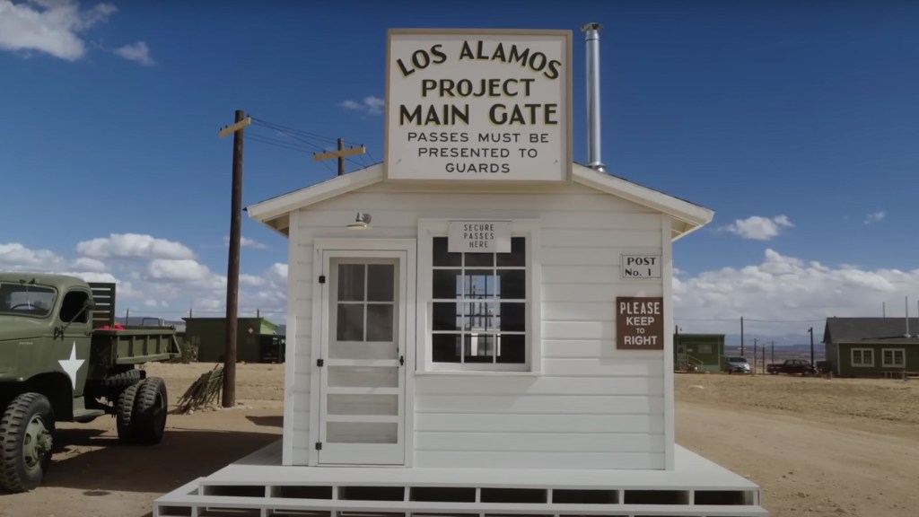
It’s a testament to how strong this field is that Oppenheimer isn’t my winner going away. I mean, they basically rebuilt Los Alamos for this movie. Yeah. An entire makeshift town went up as a living set for the Manhattan Project, and it still wouldn’t get my vote. In almost any other year this’d be a no-brainer. Not this time, though.
And I don’t want to discount what went on here, because the work is stellar. Not only is the desert town recreated, but the halls of Congress, the campuses of Cambridge, Göttingen, and Berkeley, and the White House. All of these facsimiles are impeccably constructed in a way that makes them feel almost interactive.
Not to be outdone is the use of space and props in keeping with the film’s central metaphor about scientific exploration. As Oppenheimer learns his craft and the bomb is developed, just about every space is large and wide, even in the rare scenes (Niels Bohr’s lecture) where the room is filled with people. Once the trajectory of the bomb is clear, things become tighter and more narrow. Of particular note is the hearing room where Robert is informally put on trial. It’s just a long, rectangular room with a conference table, a few shelves, and a side couch for Kitty to sit on for most of the proceedings. And yet people are packed in like sardines to an almost claustrophobic degree. Similarly, the scenes with Albert Einstein are a great representation, as the first meeting is out in the open, by a pond, with tons of space around. When Oppenheimer consults him later on the math, it’s on a narrow trail in the woods. The path is laid bare, and there’s only one direction to go from this point of no return.
Again, just about any other year, I would almost not even bother with this category. Okay, I would, but it’d be hard to fake like anything else had a chance. That’s how good this is, and that’s amazingly how great this group of candidates is as a whole.
Poor Things – Production Design by James Price and Shona Heath; Set Decoration by Zsuzsa Mihalek
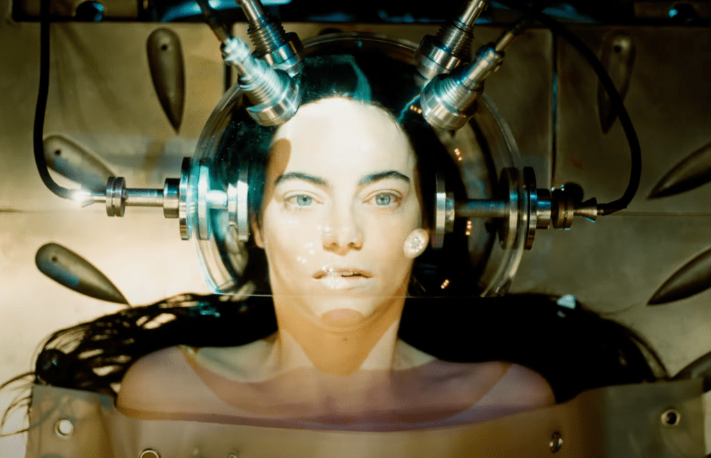
Given the bonkers nature of this film and its Frankenstein motif, of course the sets are going to be insanely detailed and conspicuous. Godwin Baxter’s lab looks like an amusement park approximation of gothic horror, and his house is a circus of checkered floors, expensive dishware, and vibrant blossoming gardens. It’s so antithetical to the drab nature of Victorian England, and yet just about everything has a purpose, some aspect for Bella to explore and understand, at least when she’s not literally being experimented on. There’s also great usage for the rooftop area, showing off spectacular views while also giving Bella an informal and unintentional playground.
And then of course, once she scampers off with Duncan, the entire world almost becomes a steampunk wonderland, full of odd contraptions, abstract building dimensions, and labyrinthine streets. There’s a bustle of activity everywhere you go (and not just in the “furious jumping” sense), and little details to discover on the periphery of almost every shot. There’s also the cruise ship, which has its own fun designs, but even more giddy is the way it’s framed like a miniature in a diorama when it’s actually sailing in open waters. It almost has a stop-motion animation feel to it.
Finally, of course, who could forget the interstitial chapter title cards, where Bella is literally sitting and lying down on chunks of brain? I mean, you’ll be hard-pressed to find a more unique set design than that!
***
As I said with Oppenheimer, this is an incredibly special set. Or at least, it is for 80% of the field. My fifth place film isn’t bad, just one where most of the elements are stuff we’ve seen a thousand times before, and even then, they have their merits. However, as great as this list of nominees is, for me this contest was indeed over before it really began. I mean, from the moment I first laid eyes on Barbie Land, how could I really vote for anything else?
My Rankings:
1) Barbie
2) Poor Things
3) Killers of the Flower Moon
4) Oppenheimer
5) Napoleon
Who do you think should win? Vote now in the poll below!
Up next, we started the week with the Shorts program, and we’ll end the last print breakdown this week with it as well. And just like Animation, everything is great in its own way. It’s Live Action Short!
Join the conversation in the comments below! What set designs grab your attention most? Should CGI sets be discouraged? Just how, exactly, did Ken convert the Dream House into the Mojo Dojo Casa House? Let me know! And remember, you can follow me on Twitter (fuck “X”) and YouTube for even more content!

One thought on “Oscar Blitz 2024 – Production Design”