Ladies and gentlemen, children of all ages, horny stoners who thought they typed in “actuallyLAID.com,” welcome to the 2025 Oscar Blitz! The stage is set, the merits have been weighed, Netflix’s checks cleared for everyone who had to pretend Emilia Pérez was good, and it’s time to finally dive in and break this sucker down! Twenty-three categories will have their moment in the spotlight, either here or on my YouTube channel. I’ve spent the past two months cramming as much content into my eyeballs as possible, because the vast majority of hopefuls were released deep into Awards Season, and I may never sleep properly again. But I do it happily, because film is the purest form of modern art there is, and to one day accept the highest honor in the industry is the dream of everyone who ever fell in love with it.
We begin the Blitz tonight with the most commercial category of the ceremony, Visual Effects. While high dramas and prestige fare dominate the proceedings, this has been the field for the blockbuster pretty much since the 1970s. It hasn’t always been a true contest, with several early winners being declared as special prize recipients, and for a long time the competition was between two or three films at most. But since 2010, it’s been a full race between five nominees, and over the course of the award’s history, the definition of what constitutes “visual effects” has been rewritten.
From the beginning, the craft has always been about what could be added to a scene to create something otherworldly that couldn’t be simply performed on camera. For a long time that meant practical movie magic, like using wool, compressed air, and musical wire to create the tornado in The Wizard of Oz, which could then be superimposed onto a live shot or composited in the editing room. As years went on, elements like chroma keying (blue/green screen splicing), laser lights, animation, pyrotechnics, miniature models, and forced perspective photography all got added to the mix.
Nowadays, sadly, the name of the game is CGI. It’s not that computer-generated imagery is inherently bad, not at all. There are literally hundreds of thousands of programmers and digital artists who work tirelessly (and are usually grossly underpaid) to come up with these designs and render them into existing scenes. The problem is that so much of the industry has become about using CGI as a substitute for storytelling, using effects as a crutch rather than a supplementary tool, and it’s done in a depressingly industrial way, where various contractors work impossibly tight schedules with minimal budgets to create something mind-blowing, only for it to fall straight into the Uncanny Valley and require the film editors to darken the scenes so no one can see.
This is why my first rule when judging this category is adhering to the definition of the actual words. In order to have an “effect,” you have to have a “cause.” To put it another way, give me a reason for this stuff to be on screen. The effect cannot simultaneously be its own cause, which is why I utterly despise the likes of Disney’s Lion King remake, because that was a 99.9% animated film (the opening shot was the only live action photography in the entire movie), meaning there was nothing on screen to change or enhance. It was just a cartoon. You can argue it was a realistic-looking cartoon, but it was a cartoon nonetheless, and thus should have been ineligible for this prize. There are several films that have entire scenes and sequences done through VFX, but there needs to be something else, something, well, human, to sell the illusion. If that’s not there, then there’s no point.
There’s a second rule, which is more of a guideline than ironclad requirement. I have to believe what I’m seeing. Preferably, this means an effect that looks like it’s actually there on the screen, like it could be physically tangible. In lieu of that, give me something that’s an active element in the scene and the story, some form of interactivity with the rest of the cast or environment, so that I can trick myself into thinking it’s there. The best example of this is the Lord of the Rings trilogy and Gollum. Andy Serkis performed live on set wearing a motion-capture suit, and the creature was added in post. Was the design all that realistic? Sort of, and by 2002 standards it was damn near immaculate, but what really mattered was that Sean Astin and Elijah Wood could share the same space with him, talk to him, touch him. That went a long way towards appreciating the moments where Gollum’s alone, arguing with himself. We see no actual persons on the screen, but we saw them before and we’d see them again after, so we could connect the dots in our own minds to make the leap that what we were witnessing was captured on a real camera.
For something of a case study, let’s compare two films that use the same character. Last year, Godzilla Minus One took home this prize. That team created a fairly realistic rendering of the king of the monsters, made sure to give it sharp detail in its designs – particularly the eyes, teeth, claws, and scales – to make him feel literally more fleshed out, and the majority of his scenes involve direct contact with the cast, whether he’s stomping his way through Tokyo, chasing the gunships at sea, or chomping on some poor bastards on Odo island. Care was taken to ensure that the audience experienced Godzilla’s presence rather than just watching it, and they did it on a total production budget of $15 million, because they knew where and how to properly allocate funds and get the workers behind the concept. Contrast this with Godzilla x Kong last year. It’s just visual noise. A fake-looking ape, a strawberry-flavored lizard, a bunch of shitty lights and fake explosions, and the only humans are either off to the side for cutaway reaction shots or are tiny CGI ant people themselves to create a false sense of scale. It’s flat and uninteresting. Sure, there are a couple of cool moments, like the suplex off the pyramid, but they were just small, fleeting parts of something that looked completely artificial, and somehow it cost ten times more money.
So that’s where I sit on the art and technology that I’ll be adjudicating tonight. Will the five hopefuls live up to that standard, or are they just standard-issue? Let’s find out.
This year’s nominees for Visual Effects are…
Alien: Romulus – Eric Barba, Nelson Sepulveda-Fauser, Daniel Macarin, and Shane Mahan

The effects of Alien: Romulus are something of a mixed bag, and honestly, it’s a shame that this is the only nomination the film has, because the cinematography and production design certainly deserved recognition as well. Those are the elements that made the good effects work even better, and their absence only compounds the weakness of the lesser ones.
Let’s start with the positives. The face-huggers swarming through the corridors was really well done. Seeing the actors bat off a few of them only for another one to jump onto someone’s head was an intense escalation from the previous films. The full-grown xenomorphs, which were mostly puppetry, kept their creep factor when their movements necessitated a shift to more fluid CGI motion. Speaking of fluid, the zero-gravity traversal of the corridor filled with xenomorph acid blood was pure gold! Also, if nothing else, I just really enjoyed the design of the planet that the Romulus station is orbiting, complete with ice chunk rings. When the effects are on point, they’re really good. They’re properly lit, there’s solid interactivity with the actors, and the scale is believable.
That said, there are two major strikes against giving this the win. The first is the film’s “final boss,” for want of a better phrase, the human-xenomorph hybrid. This is where the cold light of day backfires, because it just looks so silly and fake. You can’t even be grossed out by how it tries to nurse itself on Isabella Merced because you’re laughing too hard at how absurd the design is. The second is the truly bad form decision to use generative AI to graft the late Ian Holm’s face onto the Rook android. Yes, I know they got his family’s permission. I don’t care. The industry is still recovering from two labor strikes over the use of AI, and somehow various productions are still trying to find ways to skirt the CBAs to incorporate it even more in place of human workers. Further, having an antagonist who looks like Ash doesn’t serve the plot at all. It’s just a feature-length Easter Egg. You could use any actor to just play the part normally, and the point would still get across. In fact they used an actor on set to serve as Rook’s model before they put Holm’s face on it. So why did we have to insult the labor struggle for the sake of a callback? Even worse, the effect itself was bad enough that the production had to “fix” it for the home video release. So, if even the director thinks it wasn’t good enough, why are we here? This is a figurative and literal case of bad optics.
Better Man – Luke Millar, David Clayton, Keith Herft, and Peter Stubbs
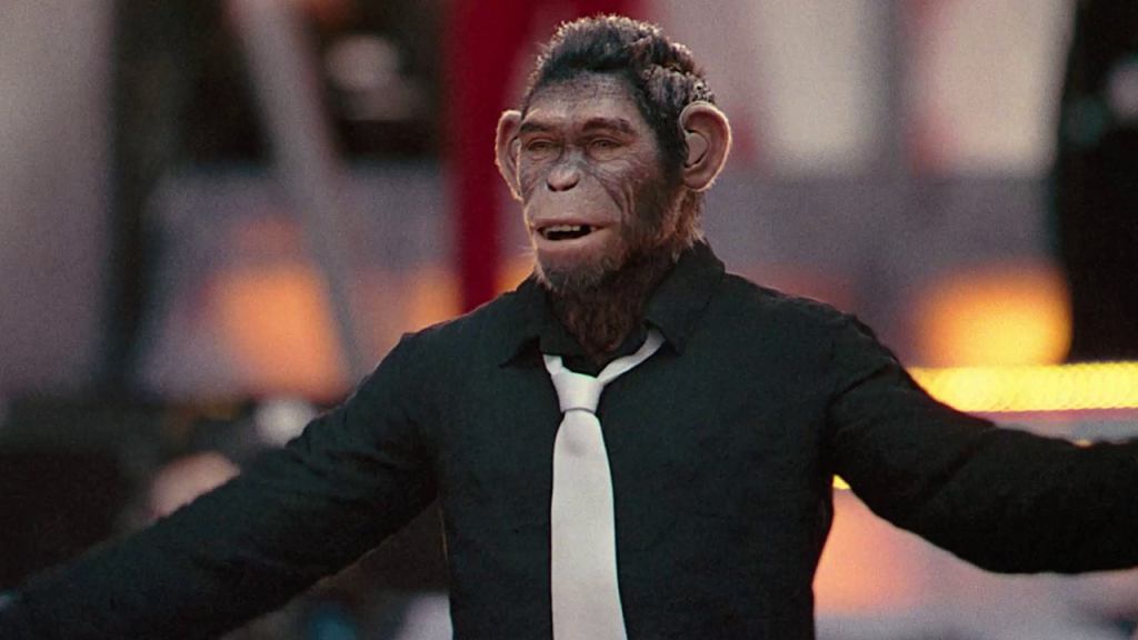
A film like Better Man is a great example of my personal philosophy on CGI effects. The entire film is based on the gimmick of Robbie Williams depicted as a chimpanzee rather than a human, so literally every shot is an effects shot. But we’re not doing it just because we can. The premise is that Williams has always seen himself as “less evolved,” so using a different primate is a fantastic illustration of the point. The “cause” is Williams’ self-image and sense of worth. The “effect” is the literal monkey suit. Right off the bat this is a more justified use of VFX budget than Rook. It has a reason to exist.
As for the effect itself, it doesn’t look particularly real, but this is where that human element of interactivity comes in. Jonno Davies was live on set for most of the scenes, and the rest of the cast performs with him, giving him direct eye contact and working within the same space. These actors are communicating with someone who is actually there in front of them, not some dot on a tennis ball that they use as a focal point. That helps the viewer fill in the visual gaps and suspend disbelief, which extends to the moments that are much more effects-driven, like the simulated one-shot musical number when Robbie joins Take That, or the scenes where there are no live humans on screen, like his climactic battle with several simian versions of himself at Knebworth. Yes, there’s a bit of Uncanny Valley sheen in the final render, but the work was done to convince us that it could be real, and sometimes that’s enough.
Dune: Part Two – Paul Lambert, Stephen James, Rhys Salcombe, and Greg Nefzer

The team that took home this award with the first Dune film definitely looks poised to repeat, as they’ve taken the grand scale designs and effects that got them the win last time out and dialed them up to 11. This movie was originally supposed to come out in 2023, but the SAG strike made it so the actors couldn’t promote the film, so Warner Bros. delayed it to the spring of last year, where it instantly became the first truly great picture of the year. Had it come out on schedule, last year’s Visual Effects contest wouldn’t have even been a discussion. So has the competition risen to meet it now? Honestly, not really.
We still have all the really cool aspects that we had the first time, from the sand worms, to the war machines, to the practical pyrotechnics that use CGI more for an enhanced blast radius rather than just being the entire explosion. Massive teams of background actors and stunt performers had to react in real time to those booms, with digital additions only put in for wider shots where they’d be indistinguishable from the live crowds. There are also more shots that experiment with lighting design and weather, more ways to manipulate the sand of Arrakis itself, and more scenery in space where CGI star movements make shots of miniatures look even more pretty. All of this furthers the goal of making this world feel lived-in, like it could feasibly be humanity’s far-flung future, and Denis Villeneuve’s team continued to pile on moving pieces to reinforce it, like having Timothée Chalamet and others actually ride the damn worms, using the poison from the baby worms as a more concentrated bluing of the body like exposure to spice, creating harsher sand storms in the southern hemisphere, and getting the actors closer to the Harkonnen military (the scene of Paul and Chani fighting that giant machine still gets me with how much ass it kicks).
But it’s not just about building on what you already have, you also need to bring something new to the table, which this team most certainly did. No moment was better than Feyd-Rautha’s introductory battle in the Harkonnen arena. Filmed using specially-made infrared cameras, the entire sequence was shot in black and white, essentially making it look like they were recording a negative. Then in post, the color contrast was ramped up significantly, creating a very sharp image that perfectly illustrated the cruel absolutism of the Harkonnen clan. This made for a scene that was shot in sweltering desert heat, but somehow felt cold and detached, and it was extraordinary.
Kingdom of the Planet of the Apes – Erik Winquist, Stephen Unterfranz, Paul Story, and Rodney Burke
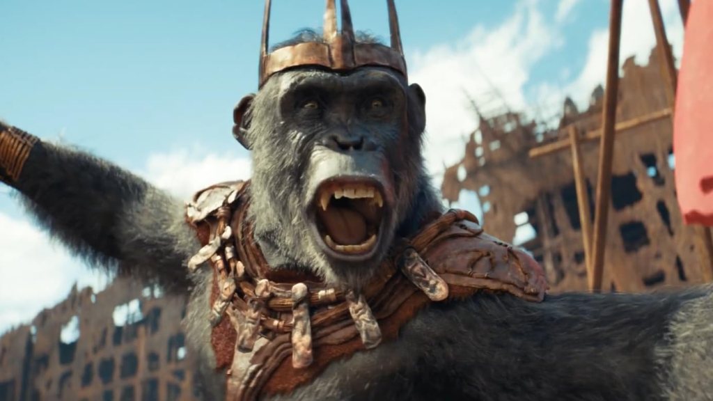
I liked this movie. I really did. It was an intriguing treatise on legacy and the bastardization of a message – in this case Caesar’s from the previous trilogy – for those who seek unchecked power. It was a lot of fun, and watching it in IMAX made for an immersive experience. And for what it’s worth, the effects here are good. It’s just that they don’t measure up to the better entries in this field, including its primal counterpart in Better Man.
This is a textbook case of “less is more.” With Better Man, we had Chimp Robbie as a lodestar, able to filter all the emotion through his beastly lens and direct the action. In this film, which basically only has two human characters, things just feel a bit too artificial. The motion capture work is a great as ever in this series, but it just comes off as too much because we don’t have an audience cipher like we did before. We just have William H. Macy for a few scenes and Freya Allan as a glorified sidekick. There are so many CGI apes around that, mo-cap or no, they just stick out like sore thumbs and don’t feel like they’re interacting with anyone.
Further, while the reboot trilogy had enough real scenery to give the audience a chance to suspend disbelief, pretty much every set and landscape in this film is digital. It’s not entirely on a blue screen like the Jungle Book remake from 2016 was, but you can instantly tell when we’re in an actual setting and when we’re just looking at fake backgrounds. This takes away some of the tension, and when the climax literally opens the floodgates to have our heroes win the day, it looks far too cartoonish.
Had there been fewer anthropomorphized apes, or more detail was given to the ones that mattered, this probably would be a much better contender. As it is, it’s the fourth film in the reboot series to get nominated, and it’ll almost certainly be the fourth to lose. I like it. I truly do. But it pales in comparison to the top spots.
Wicked Part One – Pablo Helman, Jonathan Fawkner, David Shirk, and Paul Corbould
A note before I dive into this. The Academy has taken to simply calling this film Wicked as its official title. I will not be doing that. The title of the film is Wicked Part One. That’s what it was made under, and that’s what appears on the onscreen title card when it begins. I don’t care that they changed the name of Part Two to Wicked For Good. That doesn’t make it a sequel. It’s still the second half of THIS movie. Argue semantics with me all day if you want. You will not change my mind. As far as I’m concerned, just saying Wicked is nothing more than shorthand. It’s shorthand that I may use myself in this space from time to time, but when it comes to truly naming the film, I’m using what it actually is, rather than what a marketing team wants it to be.
Now, on to the effects, and… you’re kidding me, right? This is one of the top five? Really? Oh gee, where do you start? How about the completely desaturated and washed out color palette that makes the whole movie less bright and vibrant than the original 1939 Wizard of Oz? Yeah, a film from 85 years ago is more colorful and imaginative, even though every scene save one occurs on sunny days or cloudless nights.
Or maybe we can focus on how fake the Emerald City looks as a CGI setting in contrast to the practical sets of Shiz or Munchkinland. What about the monumentally silly “Oz Puppet” face? Ooh, we can talk about the embarrassingly bad CGI nursemaid bear. Hell, one of the major characters is a totally unconvincing CGI goat. As I said in my review, Peter Dinklage’s vocal performance lent just enough credibility for me to set the laughable design aside, but that didn’t stop it from being phony as shit.
But really, the moment that sums up just how bad these effects are comes right at the end, during Elphaba’s triumphant and defiant escape set to “Defying Gravity,” inarguably one of the best showtunes ever written. As the scene unfolds, Galinda gives Elphaba her broomstick and a cape that she finds on a nearby mannequin. You can tell by looking at it that the cape is about six or seven feet long, as it goes all the way to the floor and creates a small train. Still, it’s short and light enough to toss over Elphaba’s shoulders, and she’s able to move around in it without obstruction. Moments later, as she declares “No wizard that there is or was (or might be in the future, during normal business hours, between Tuesday and Sunday, we’re closed on Monday, all rights reserved, do not retransmit without the express written consent of Major League Baseball)…” you see her floating in the air, and that cape is at least 20 feet long, at least three times as tall as she is, meaning it would weigh close to 100 pounds. That is some shit people should be ashamed of. It’s just a complete dismissal of scale and continuity. You want to make the cape longer, have her cast a spell to make it longer. Don’t just change the laws of physical matter because you think it’ll make a cool shot, because it won’t. If it was actually that long she would have snagged on the first sharp corner she flew by and would have fallen to her death, assuming she could even get off the ground. This is almost as fraudulent as putting Mufasa in this contest… almost.
***
So, after all that, I’m pretty sure you can guess where I stand. We have one film that has no business being here, another that used AI, which is a big no-no, a previous winner improving on what got them the win last time, and two movies featuring apes, and the one that had the least amount of them is far and away the better work. There will be categories during the Blitz that will be very difficult to narrow down and choose a winner. This is not one of them.
My Rankings:
1) Dune: Part Two
2) Better Man
3) Kingdom of the Planet of the Apes
4) Alien: Romulus
5) Wicked Part One
Who do you think should win? Vote now in the poll below!
Up next, my eyes are already tired from all the viewing I’ve had to do, so let’s give them a break and focus on some audio instead. It’s Original Score!
Join the conversation in the comments below! How many of these films have you seen? What makes for great effects in your eyes? Seriously, how did Elphaba not trip over that cape 47,000 times if it was meant to actually be that long? Let me know! And remember, you can follow me on Twitter (fuck “X”) as well as Bluesky, and subscribe to my YouTube channel for even more content, and check out the entire BTRP Media Network at btrpmedia.com!

2 thoughts on “Oscar Blitz 2025 – Visual Effects”