Yesterday I covered the Film Editing competition, the category I am likely most qualified to judge on a professional and objective level. Tonight, we do a complete 180 and go to one of those that I have basically no expertise in, Production Design. This is always a duel prize, awarded to the titular designer, who’s in charge of the overall artistic aesthetic and scenery in a film, as well as the Set Decorator, who supervises all the figurative and literal window dressings for the location, including props, furniture, and stage construction. For the longest time, the main idea was to spotlight the interior design of a stage. In fact, up until the 1950s, the set decorator was referred to by that professional moniker. In the modern age, however, exterior locations have also been considered, so long as there’s still some sort of set to dress rather than just pure nature, and we’ve even seen a nomination for 100% digital sets that had no material decoration whatsoever. I still don’t know how that’s allowed, which may be one of the many bullet points against me being knowledgeable on the subject.
I can’t even really tie this into any personal experience, because what I have is extremely limited. In high school, part of the process of putting on plays was building and striking the set, but I never did all that much, as I’m not the handiest man in existence. I mostly just painted walls and backdrops. The stage manager oversaw prop needs, but basically we just provided whatever we could ourselves and kept track of what we were using in a given scene. When I took that class in college about making a TV pilot that I mentioned last night, everyone was expected to pitch in on the sets, but I did far less than everyone else because I had a paying campus job and construction conflicted with my shifts. I caught some flack for that, but for a broke ass kid like me, money mattered far more than whether I got an A or an A- (for what it’s worth, I got a B+, which was retroactively upgraded to an A after I edited the show). I did what I could, which was mostly providing some of my very limited furnishings for use and painting a few shelves.
After college, I went back to my old high school to work part time as a study hall monitor, because that was the only work I could get, and I took on the task of directing the fall play as well. We were going to do The Philadelphia Story, but the production was canceled about halfway through rehearsals. During that time, I tried to work my way through all aspects of putting on the show, including a lot of areas where I had no idea what I was doing. Rehearsals? No problem. Improv and acting exercises to help the kids remember their lines? Sure. Blocking? All good. But the actual sets? Ooh boy, was I in over my head. I knew what I wanted them to look like, but apparently I was supposed to get started weeks before I even held tryouts, especially if I was going to use the shop class kids as builders (part of the requirements for graduation is for seniors to do something like 40 hours of community service as part of their “Participation in Government,” or PIG class, and working with the faculty was a common method to rack those up; I did it myself when I was their age by basically being my choir director’s personal assistant for a semester).
The show was called off before we could start construction, but I learned fast that I needed a ton of help drafting what I wanted (a three-panel stage that could be spun around so that the interior and exterior sets could remain on stage without switching them out), gathering the materials, and sourcing props. I had what I thought was a clever idea to conscript the stage crew as “servants” in the house, so that they could move freely in between scenes placing various objects around the set without having to wear all black and rush around in the dark. We even found costumes for them, and the kids seemed to like the idea. But yeah, I was so far out of my wheelhouse that I might as well have been back at daycare.
This is why I have to lean on my personal tastes when it comes to analyzing this category. Over the years I’ve been able to seek out and notice exemplary displays of design, but in the end I’m basically just guessing and allowing myself to be in awe of what people far more talented and specialized than me are able to accomplish. I’ve said it quite often that I’m extremely impressed by people who do what I cannot, and this is an area where I simply admit defeat. I will never be a designer, and that’s okay. I can just let my eyes bug out when I see something amazing.
This year’s nominees for Production Design are…
The Bruatlist – Production Design: Judy Becker, Set Decoration: Patricia Cuccia
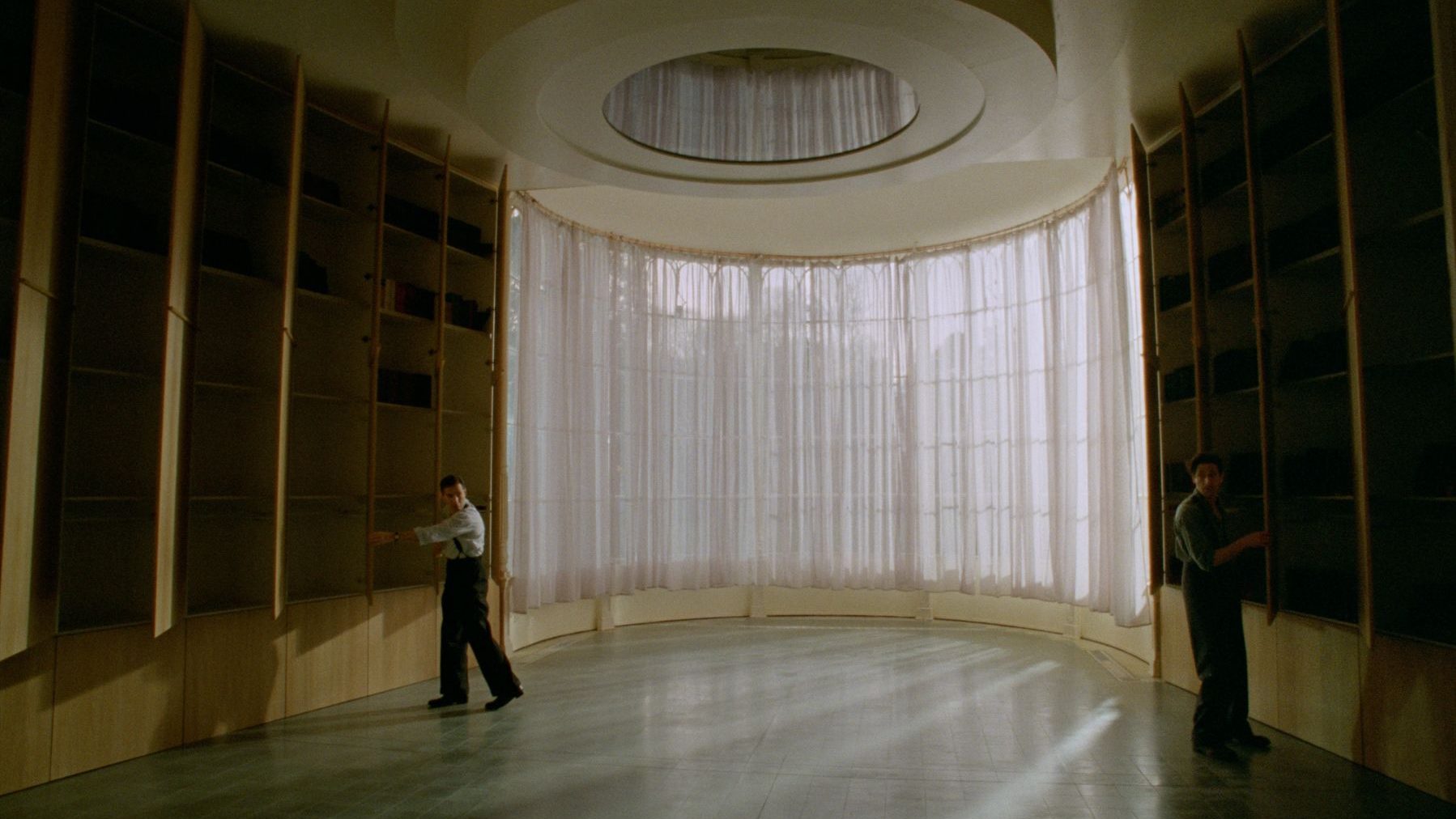
This is sort of a “DUH!” nomination, because if you have shitty production design on a film about an architect, well then you’ve just straight up failed. Just like how Phantom Thread won Costume Design, this is an element you simply have to nail in order for the film to have any prestige credibility. Thankfully, for the most part, Becker and Cuccia did exactly that.
Much of the work reflects the artistic style of the film’s lead character. László Tóth’s designs and structures are meant to be sturdy and enduring, but also contain areas to cloister and hide, a testament to the survival of the Jewish people through the Holocaust. You get the first impression of this when he works on the Van Buren study, creating closed cabinets to store the family’s books that gives off a sort of Schrödinger vibe, as no one can tell just how many literary treasures they contain until you open them all in one joint row. The rest is left almost bare, just a comfortable chair and a small table and stand so that Harrison can enjoy his reading time completely detached from the more gaudy displays of his wealth.
The motif extends from there, as a stark contrast is displayed between Harrison and László. The former’s estate is sprawling and garish, while the latter spends half the film sleeping in closets. Even when László’s wife arrives, their living quarters are either extremely Spartan or cramped with what meager belongings they can afford, while the Van Buren mansion almost delights in its lack of spatial economy.
There is one major knock, however, and that’s in the epilogue. I mentioned this yesterday when discussing the Editing, that there were two key areas where The Brutalist opted for generative AI despite the implications and backlash. This is the other context. During the epilogue, when the life and work of László is properly celebrated, a massive gallery of buildings designed by the character is displayed. All of these renderings are AI. None of these structures actually exist, nor were they designed by human beings on the production team. They are computer-generated amalgams of other brutalist style creations. That is simply not cool. It was entirely possible, and reasonable, to simply repurpose actual photographs or have a graphics designer come up with some on their own. It’s a clear error on the part of the Production Designer to have them made, and on the Set Decorator to put them in places where they could be seen, so I have to dock a few points from what was otherwise a solid effort.
Conclave – Production Design: Suzie Davies, Set Decoration: Cynthia Sleiter
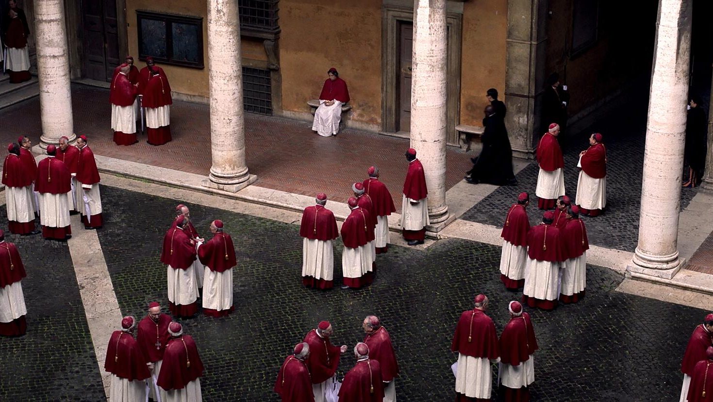
The art direction of Conclave is at once the easiest and the most difficult task of any of the contenders, in that the main location for the film is a well-known world landmark, but since the crew couldn’t actually film there, it all had to be recreated from scratch.
The Sistine Chapel is one of the most famous buildings on Earth, but that doesn’t mean it necessarily lends itself to cinema. Great care was taken to replicate the look of the chapel, but some liberties were taken, in order to give the place a more oppressive, prison-like feel. You can see this in the various gates, daises, and courtyards, all of which have some architecture that uses bars and barriers as a means of visual separation. Further, the papal residence, which is closed off to even the Cardinals in the wake of the pontiff’s death, is adorned with a sleek cloth rope, basically the Vatican equivalent of police tape. It’s both beautiful and depressing, and an absolutely incredible facsimile of the real thing.
Similarly, there’s a really effective use of stone throughout. Part of this is the general nature of the actual buildings in the Vatican, but it is noticeable just how little grass or metal you see in the structures. Concrete pillars, dark tile slabs, cobbles that line the walking paths, narrow spiraling staircases for private conversations contrasted with wide, grand ones for more open and public scenes. The Church has, historically, dealt in absolutes, figuratively setting things in stone. The set design renders this far more literal. The institution must remain solid and unshakeable regardless of the outcome, which is why more malleable materials are nowhere to be found, and more modern infrastructure like computers and printers feel so out of place as to be almost anachronistic.
Separately, each Cardinal’s accessories are something of a reflection of their character. Lawrence has a coffee machine because he is warm and welcoming. Benitez’s room is all but empty, as he has no need for material goods. Tremblay and Adeyemi have photos of themselves adorning the walls. One of his first actions of the film sees Bellini ask Lawrence if he can have the late pope’s chess set, noting its sentimental value, as they often played the game together. No need to explain the thematic significance of that particular prop. Then of course, there’s Tedesco, who almost always can be seen with a cigar in his mouth, lording his entitled position over the rest of the college.
Dune: Part Two – Production Design: Patrice Vermette, Set Decoration: Shane Vieau
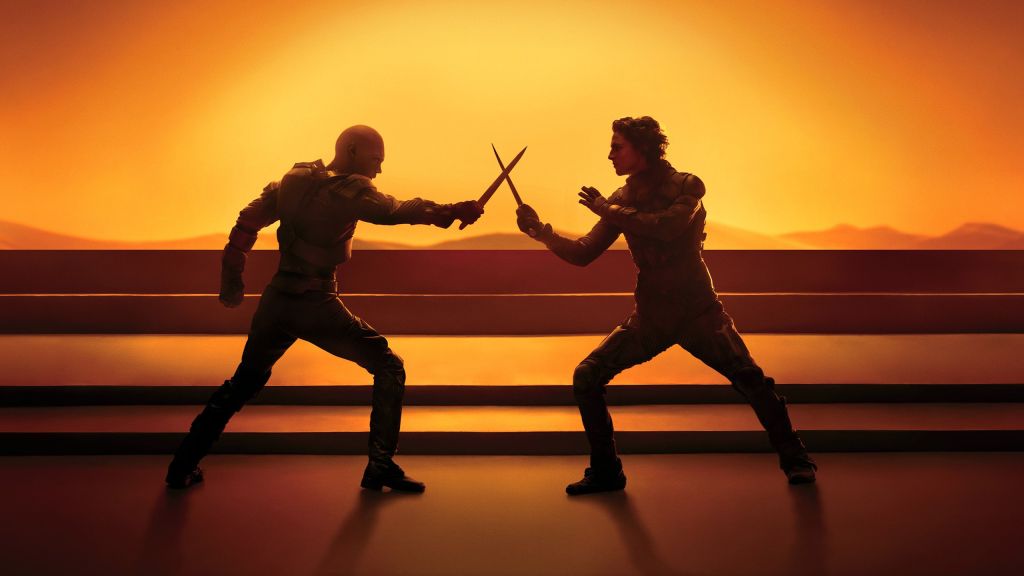
Vieau won this award seven years ago for his work on The Shape of Water, while Vemette won three years ago for the first Dune installment. And let me tell you, the ante has been upped significantly for the second go-round. Whereas before the task was all about establishing the sheer size and scale of Arrakis, this time, it’s about creating intimate spaces within the vastness, and it’s pulled off to near-perfection.
In the first film, we got a few hints and short visits with the respective bases for Houses Harkonnen and Atreides, as well as the Bene Gesserit, while much more time was spent on the fortress on Arrakis and the desert dwellings of the Fremen. We still get those latter locations, but the former ones are expanded exponentially, adding more ships, the entire southern hemisphere of Arrakis, and the Imperial headquarters. The world has been set up. now it’s time to show how the characters live within it.
Vast caves filled with Fremen fundamentalists, a gladiator arena bathed in sharp black and white tones, vats of oily goo, regal halls, barren corridors. All of these settings solidify the character types that inhabit this universe, be it the cold, lethal Harkonnens, the warm remnants of the Atreides family, or the detached aristocracy of the royals. By the time Paul and Feyd-Rautha have their final duel, the sets alone have told us everything we need to know about the parties involved.
Then, of course, we get the well-made accoutrements from the prop department. New weapons, squiggly baby sandworm puppets, devices that suck the water out of dead corpses, and so many other intriguing tools succeed and aiding the mythos, because they’re all used in ways that feel completely natural and normal to the characters. They’re completely foreign to us in the audience, but the people on screen know exactly what to do. That goes a long way towards keeping the viewer engaged. The people on the screen don’t question the purpose or utility of what’s in their hands, so we don’t have to either.
Nosferatu – Production Design: Craig Lathrop, Set Decorator: Beatrice Brentnerová
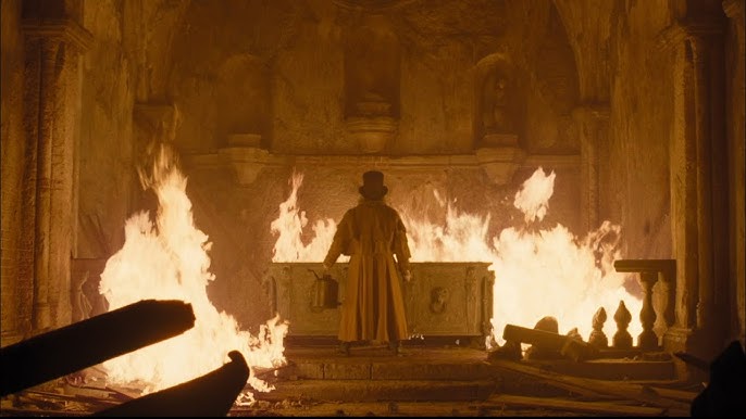
The core of Nosferatu‘s design is an overt creep factor and a more subtextual removal from civilization and humanity. As Thomas travels from Germany to Romania, the journey is a slow descent into Hell, represented by the evaporation of anything resembling a comfort or luxury of his life. Back home, his house is well-appointed with Victorian-era furnishings, artwork, and tools of convenience. When he gets to Transylvania, he witnesses a village seemingly out of time with what he’s used to, as paved streets give way to muck and grime, and even his one-night stay at the inn is little more than a hovel. Once inside Orlok’s castle, the monster’s homestead is practically empty, leaving him to focus on the imposing size of the structure, lit with only a few candles.
This contrast persists even when to focus shifts to Ellen back in Wisburg. When she goes to stay with the Hardings, we see rooms filled with ornate possessions, an almost overcrowded scenery where the family wants for nothing. As her condition worsens, however, we see less and less of the house, and her room becomes more barren, as if the actual on-set props are being stripped away along with her mental faculties. It ends up creating a juxtaposition on both sides of her malaise, as Orlok’s arrival brings focus to the rat-infested sanitarium which looks like more like a damp dungeon than a hospital, while Professor von Franz’s home is littered with books, papers, and other various knickknacks relating to his occult studies. Sanity and insanity are literally separated by the accumulation of knowledge, and she’s caught in the middle.
The gothic horror elements are on point, with the scope of Orlok’s dominion casting a pall on everything he touches, which works really well against the more lavish lifestyle of the well-to-do leads. But it’s the finer touches that spotlight the suppression of our animal instincts and drain the victims of their identities. A beast has no need of a fancy dinner table, but it knows the dangers of fire just as well as we do. It’s pretty cool stuff.
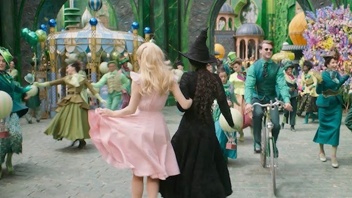
Wicked Part One – Production Design: Nathan Crowley, Set Decoration: Lee Sandales
Crowley and Sandales are no strangers to this competition. Crowley is on his seventh nomination to date and Sandales is on number three, though sadly neither has won. This is probably their best chance in a while, as Academy voters will want to make sure that Wicked wins something, and given the task at hand, this is a golden opportunity. The competition is incredibly stiff this year, however, so who knows?
The original Broadway musical was mostly performed on one large set, modeled after a clock, with lots of moving pieces that can be switched out. Eugene Lee won a Tony for the design. This means, in translating the show to the big screen, Crowley, Sandales, and their team had enormous freedom to reimagine every location and setting, to put their own stamp on things and expand this particular version of Oz as they saw fit.
And honestly, while I’m not the biggest fan of this movie, I really did enjoy these designs, at least, for the practical sets. Sometimes this category includes digital assets, as I mentioned earlier, including for films like Avatar: The Way of Water, which had no sets at all. When it comes to the areas that are clearly computer-generated, there’s a sheen of fakeness all over them, to go with the washed out colors that made the rest of the VFX so underwhelming.
But when it comes to the pieces that are actually tangible and there, I liked a lot of what this team did. In particular, when it comes to Shiz I loved Dr. Dillamond’s classroom and the library. There are some elements that can be nitpicked, like how someone was able to either write upside-down on Dillamond’s chalkboard or understand the mechanics of it to set it up as a surprise, or how you can have wheel-shaped bookcases but not have the books fall out of them once they start spinning (you can say “magic,” but if that’s the reason, SHOW IT TO US!), but for the most part, these designs are a lot of fun.
The best sets of all come in Emerald City, where the town square used in “One Short Day” felt like a completely interactive environment, echoing the engineering and movement style of the Broadway set while still having its own identity, and the Wizard’s chambers, complete with his own miniature model of Oz itself. Having different lighting choices for “the road” was a very clever touch as well. The aesthetic isn’t exactly fantastical, but the sets do feel, dare I say, alive.
Genuinely, one of the fears I had when I went to see this was that the design team would just try their best to make an Oz-themed version of Hogwarts and the Wizarding World and call it a day. Thankfully, they didn’t. These sets feel distinctive and creative, and are arguably the most original element of the film. I just wish they were great across the board, rather than having the live sets be awesome and the CGI ones be crap.
***
Like I said in the preamble, I am far from an expert on this stuff, but this feels like much closer of a competition than it has in a long time. Since I’ve been doing this blog and the Blitz, there’s always been a clear separation between the films that should contend for the prize and those who have no business being in the running. This is the first time where I can honestly say that’s not the case. Every one of these would make a worthy winner and not be upsetting apart from a few shortcomings here and there. I have my preferences, but we’re talking a few points to set the nominees apart. I’d be fine with any of these taking home the honors.
My Rankings:
1) Conclave
2) Dune: Part Two
3) The Brutalist
4) Nosferatu
5) Wicked Part One
Who do you think should win? Vote now in the poll below!
Up next, I spend an entire blog trying not to scream into the void that a novel first person filming perspective is somehow considered less worthy than a hyperactive lens focused on bad people singing about nothing. It’s Cinematography!
Join the conversation in the comments below! What appeals to you when it comes to interior design? Which of these films grabbed your attention most with its sets? Did I miss anything obvious in my analysis? Let me know! And remember, you can follow me on Twitter (fuck “X”) as well as Bluesky, and subscribe to my YouTube channel for even more content, and check out the entire BTRP Media Network at btrpmedia.com!

2 thoughts on “Oscar Blitz 2025 – Production Design”