Over the last several months, I learned more about interior design than I ever cared to know. Working in door-to-door sales, focusing on windows and entry doors, my job required me to knock on over 100 properties a day in an assigned neighborhood, and attempt to set up appointments for the actual salesmen. While it was well out of my comfort zone and area of expertise, I was kind of fascinated by the process, even though I ultimately failed in the endeavor.
During the classroom training, we learned how to spot flaws and damage in windows, particularly fogging between panes and warped glass. We needed to know this information, because if a homeowner answered the door and wasn’t actively thinking about replacing them (which did happen a fair few times), they’d try to dismiss me, and it was my job to slyly point out the issues to them, hoping to convince them to at least schedule an appointment for a full in-home pitch. I came along on a couple of those “consultations” (one for training purposes, one off my own back), and saw how the salesmen (who train in class for three months as opposed to my one week) plied their trade, listening to what the homeowners were looking for, showing them our options (the company does everything custom to order), and even using an augmented reality tool to show the customer what the new door or window would look like in their existing space. I learned about color matching, frame and grid patterns, various opening and closing styles, and a whole host of other variables.
I then had to apply that out in the field. I did my best to assess any quickly identifiable problems on my way up the driveway, and also just find something cool about the house to talk about, if nothing else than to keep the conversation going. Sometimes it worked, like a woman who had a lovely sky blue paint job on her house and wanted new windows to match, and sometimes it didn’t, but I still had a nice chat about some artwork on someone’s lawn. The spectrum of reactions I got during the four months on this professional failure gave me a new respect and empathy for every solicitor I’ve ever turned away, but the on-the-ground experience gave me a new appreciation for design itself, to the point that I’ll never not notice warped glass on a window again.
Does this give me a newfound expertise when it comes to judging Production Design? No. But I can safely say I know more now than I did last year, or any other year before it. It’ll still come down to personal preference and cool shit I happened to notice, but like a lot of artistic disciplines, my sense of awe at these people who are infinitely more talented than me only continues to grow.
This year’s nominees for Production Design are…
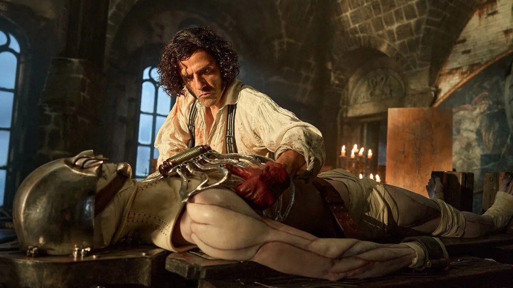
Frankenstein – Production Designer: Tamara Deverell; Set Decorator: Shane Vieau
The overall design of Guillermo del Toro’s Frankenstein comes down to two extremes – the exteriors and the interiors. That sounds simplistic, and it is, but there is a glaring difference between how the outside scenes look contrasted with the indoor ones, forcing me to grade it on an average.
On the inside, the sets are spectacular. They’re colorful, expressive, and interactive. Every prop has a purpose, every decoration adds to the mood and personality of a scene. The bent metal rod is a great visual representation of the folly of Victor’s experiment. Chaining the Creature in a sewage basement accurately portrays the shit situation he was “born” into. Filling the blind man’s hut with books gives grace to an otherwise bare setting, providing Jacob Elordi and David Bradley with enough open space to let their gentle scenes breathe. And of course, the highlights of the entire affair are the animatronic devices so that Victor can simulate life functions on partial corpses. It’s an incredible function, showing the depths of his obsession and borderline madness, as well as just being that exact level of del Toro creepy that we all know and love.
Once we step outside, though, yeesh. It’s almost all CGI on the exteriors, and none of it very convincing. Frankenstein’s castle/lab looks like it comes out of a cartoon. The water surrounding it is beyond unconvincing. The Danish ship that temporarily rescues Victor and faces off with the Creature is dull with textures that don’t blend well with the overall icy scenery, and seeing the Creature straight up lift the damn thing is comical. To be as generous as possible, maybe this was all intentional as a really meta way of saying that beauty really is on the inside, because the outer layer of this film looks ugly as sin.
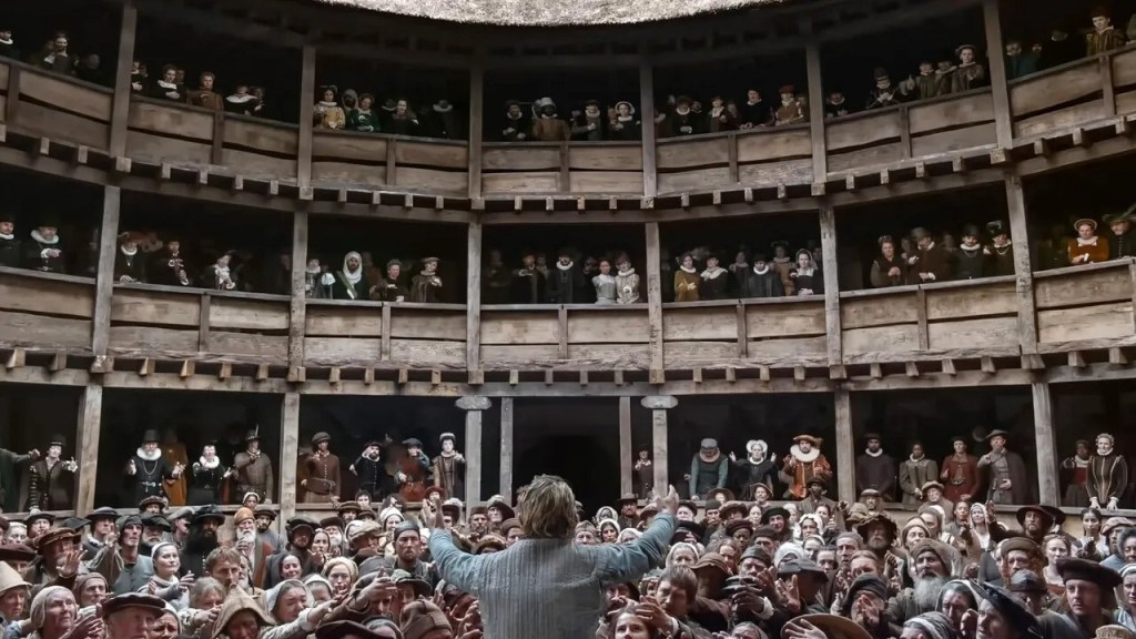
Hamnet – Production Designer: Fiona Crombie; Set Decorator: Alice Felton
As William Shakespeare himself famously wrote in As You Like It, “All the world’s a stage, and all the men and women merely players.” It’s a timeless statement about how art imitates life and vice versa, and it’s a mantra that the design team on Hamnet really seemed to take to heart. It’s fitting, because on a thematic level, Chloé Zhao’s narrative takes the same tack. It’s only appropriate, in a story about how theatre becomes an outlet for processing grief and healing, that the scenery evokes images of watching an actual stage play.
Every location in Hamnet feels like it comes out of one of Shakespeare’s works, and that it could be reproduced on a stage if anyone wanted to adapt it. The town of Stratford is filled with storefronts and buildings that could be made into backdrops and moving walls. The inside of Shakespeare’s house is decorated in a way that implies a fourth wall for the audience. The forest glens where Agnes first gives birth, communes with nature, and tends to her hawk companion are rounded and almost womb-like, a living environment for her to nest with Mother Earth. The bedroom that Will and Agnes share, where the Bard pores over his parchment, is lit in a way that feels exactly like a spotlighted aside space independent of the rest of the set.
It all culminates with the performance of Hamlet at the Globe Theatre, itself a tight, intimate space. We get hints of it throughout the back half of the film as Will decorates his painted backdrops, but once we’re there, it’s almost magical in its simplicity. A small space in the center opens up for the actors to enter and exit, inviting the viewer in just as Agnes, Bartholomew, and the other huddled masses, well, huddle at the edge of the dais. Then, in the final moments, the camera shifts to the rear of the platform, looking out at the audience that has experienced this exercise in art therapy. The fourth wall is sealed up rather than broken, keeping the narrative self-contained, but the thematic resonance remains for all who entered.
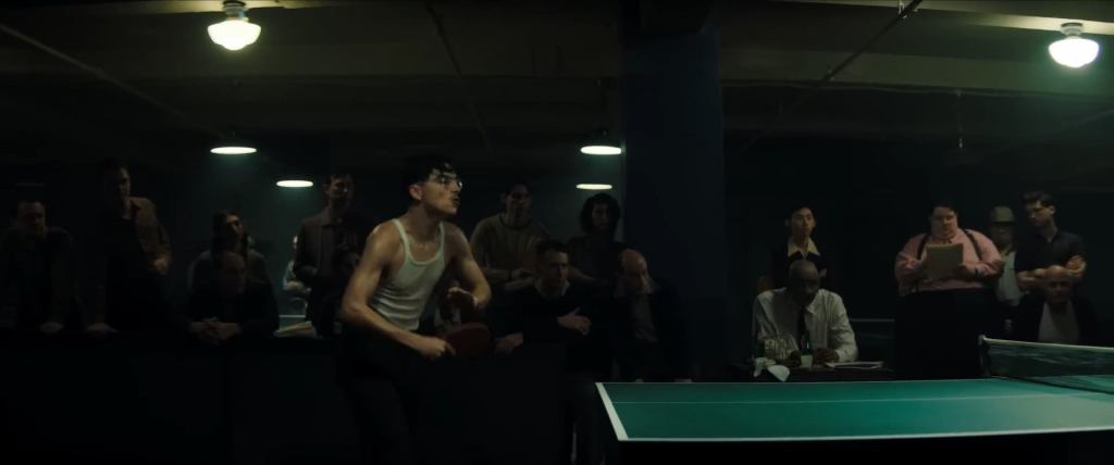
Marty Supreme – Production Designer: Jack Fisk; Set Decorator: Adam Willis
Set in the late 1940s, the success of Marty Supreme‘s design elements lie in how well it recreates that aesthetic, and for the most part, they succeed. You get the feel for post-WWII New York City in the look of Marty’s apartment, the shoe store, the bowling alley, and all the various exteriors. It all looks very impressive… or at least it would, if none of us had ever seen The Godfather, which did the same thing, only better, 50 years ago.
This doesn’t mean that the set designs in Marty Supreme are bad, just mostly run-of-the-mill. We’ve seen New York in this time period. We’ve seen luxury hotel rooms. We’ve seen fancy living rooms and restaurants. We’ve seen basketball courts. None of it is awful, it’s just that we’ve seen it all before.
There are exactly two areas that feel novel, and naturally, they revolve around the table tennis. During the British Open, the layout of the tournament itself is pretty interesting, even if the scenes are poorly lit. However, it raises some odd questions, like what the players are meant to do with the tables being so close together. Like, some of the players, including Marty, make some very emphatic, over-the-top volleys where the ball flies well past the opposing player. With the tables so close together, how do they avoid balls hitting players on neighboring tables, or just avoid stumbling into someone else’s game? The wide shots look nice, but the actual setup is impractical. If you’ve ever played ping pong in gym class, you know what I’m talking about.
For the climactic scene in Japan, however, I was genuinely wowed. The stands are tight, yet segregated. The stage is appointed with eye-catching banners. The actual stage is spacious enough for Marty and Endo to freely move around and perform their acrobatics, while still allowing for several background actors to efficiently fill out the wings. Given the weight and importance of this final moment, the place setting is designed in an appropriately dramatic way. Credit where it’s due.
Again, nothing in this is bad, just very normal. I’m sure a lot of work went into it, but very little stands out as unique or distinct from other stuff we’ve seen many times before. It’s like how period dresses used to dominate Costume Design. It all looks nice, but it’s old hat, and at this point, it’s just not Oscar-worthy.
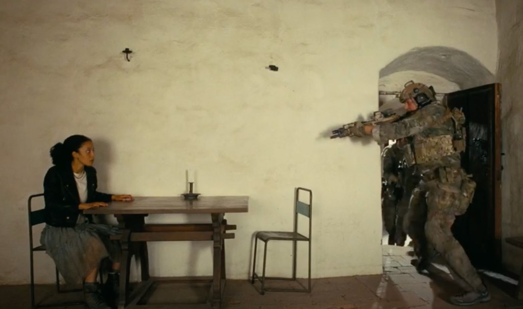
One Battle After Another – Production Designer: Florencia Martin; Set Decorator: Anthony Carlino
One Battle After Another has the most varied sets and designs of this field, and at times the props play an active role, similar to Frankenstein. One of most memorable moments of the film is when Leonardo DiCaprio and Benicio del Toro make their initial escape, with the latter going through a trap door in the floor, with the throw rug rolling over the space afterwards with perfect timing. Hell, del Toro’s entire route out of his building, illustrating his entire network of refugees and operatives, is a master class in practical design.
Once we get outside the city, however, there’s not too much to go on in the exterior space. The landscapes are awesome, and the mission where Chase Infiniti hides out before Sean Penn shows up is pretty dang nifty, but the excitement and suspense comes from a lack of design elements, as the space is wide open and barren. The remote nature of the location is what gives the final car pursuit its weight. All the involved parties converge on a road where no one would ever find them, and if our heroes can’t find a way out, they’re doomed. The fact that the Christmas Adventurers Club is able to just pull up right next to Lockjaw and shoot him at point blank range is proof of their confidence in their actions being untraceable.
A lot of the other locations in the film can be compared to Marty Supreme, in that they’re aggressively normal for the time periods they’re depicting. The difference here is that even the more mundane spots like Pat’s house, the CAC office building, and Sergio’s dojo all have personality. There are cool Easter Eggs for the eagle-eyed viewer to notice. There’s an economy of space that the actors use to great effect. Most importantly, given the nature of the plot, where revolutionaries hide in plain sight in case their lives are upended, each of these places looks truly lived-in. They have to blend, but you also can sense that something real will be lost if their covers are blown. These people fought on the frontlines then faded into the background for safety, and you can see that fragile comfort as Pat smokes a blunt on his ratty couch. It’s like Homer Simpson’s ass groove. You’d never give it a second thought unless someone tried to ruin it, and then, because it’s so unobtrusive, you appreciate it all the more.
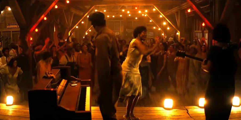
Sinners – Production Designer: Hannah Beachler; Set Decorator: Monique Champagne
Sinners has several wonderful set pieces. There’s the church where Sammie’s father serves as minister. There’s Grace and Bo’s general store. There’s Annie’s shack. There’s the cotton fields where Cornbread is recruited. There’s the train station where Mary and Stack reunite. There are plenty of great spaces.
But let’s be 100% real here. It all comes down to the juke joint and the surrounding exteriors. Inside the party house, the set is a living character. Every room has a stated purpose, both for running the business and for plot utility. The bar, the stage, the back room, the upstairs landing, all of these are active areas where certain things simply have to happen in order for the story and characters to work properly. As the night wears on, the space feels more claustrophobic despite the fact that more and more inhabitants work their way outside to meet their respective dooms, leaving the juke more spacious each time. The more open it becomes, the more the survivors have to huddle in closer to keep tabs and attempt to keep each other safe. As it’s slowly destroyed, you feel every inch of it more viscerally.
This is expertly juxtaposed with the outside, where Remmick and his team wait patiently for their moment to strike like the coiled viper found earlier in Smoke’s truck. At first, the area is very dark and nondescript. There’s a bit of moonlight shining on the ground, but nothing is distinguishable apart from a log and the nearby pond. As the plot wears on, however, it takes over the juke as the active party space. With more and more of the patrons being turned and assimilated into Remmick’s vampiric hive mind, the outdoor space becomes brighter and more energetic. Songs break out, group dance numbers begin, the earth itself feels ready to explode. The moonlight shines white upon the horde to juxtapose the red, blood-soaked interior of the hard wood in the juke. By the time the sun finally rises, bathing the scene in color and flame, the juke is nothing more than a derelict husk of itself, while the grass and trees feel renewed and ready to grow, even though the practical appointments are minimal.
More than any other film on this list, the design of Sinners comes down to one central location and how the space is utilized. Sometimes a well-placed bottle of booze is all you need to sell the moment.
***
We’re only two categories in, and as you’ll quickly realize, I’m not nearly as high on Marty Supreme as some others are. To be clear, I liked the film, but in a lot of respects, I just don’t find it up to the standards of the other nominees in a lot of these contests. Just like Best Director yesterday, it’s the one I would have no issue leaving off the final list, not because it’s bad, but because it’s merely functional. You could easily have slotted Train Dreams, Blue Moon, Sentimental Value, or The Secret Agent in here without anyone batting an eye, and that’s just considering the other multi-nominated films. Non-nominated movies like Mickey 17, Wicked: For Good, The Life of Chuck, and No Other Choice would all have more legit cases for this prize from where I sit.
But we’re not here to dwell on what should have gotten a nod, only to rate what we have. There are certainly worse films that could have been chosen over Marty Supreme (*COUGHF1COUGH*), so rather than second-guessing, let’s just honor the superlative candidates in front of us. For me, you could make a case for any of the other four, but as an old-school theatre nerd, I have to go with what most feels thematically sound when it comes to literal “staging.”
My Rankings:
1) Hamnet
2) Sinners
3) Frankenstein
4) One Battle After Another
5) Marty Supreme
Who do you think should win? Vote now in the poll below!
Up next, it’s time to get our annual humoring of Diane Warren out of the way, so that we can focus on nominees that actually earned their spot. It’s Original Song!
Join the conversation in the comments below! Are you big into design and decoration? Which film comes most to mind when you think of fantastic sets? Do you know what warped glass on windows looks like, and if so, will you ever be able to unsee it? Let me know! And remember, you can follow me on Twitter (fuck “X”) as well as Bluesky, and subscribe to my YouTube channel for even more content, and check out the entire BTRP Media Network at btrpmedia.com!

One thought on “Oscar Blitz 2026 – Production Design”