One of the most common rebuttals to film criticism is for the people being critiqued to haughtily write off those giving their opinion by saying they should just do it themselves. This has gone on for years, but it’s resurfaced in recent days thanks to the blowback against Emilia Pérez, particularly its regressive and stereotypical depictions of trans women and Mexicans. Joining the ranks of many before her who had little of substance to say, the film’s star – and Best Actress nominee – Karla Sofia Gascón quipped to Vanity Fair, “If you don’t like it, go and make your own movie.” Sadly, it’s likely the least offensive thing she’s said that’s been unearthed during the Oscars campaign.
Setting aside the facile nature of the clapback, as that isn’t even remotely how the film industry – or really any consumer economy – works (If a grocer sells rotten vegetables, they don’t get to tell the shopper to go farm their own, and if a car runs over a pedestrian, said walker isn’t scoffed at that they should design their own autos), the disingenuous nature of the retort spotlights a real problem with accessibility to cinema. The vast majority of people simply do not have the time, energy, gear, or financial resources to make their own films (though a group of stalwarts did effectively counter Gascón by creating the parody short, Johanne Sacreblu, which has gone viral on YouTube), so to posit that anyone who disagrees with a movie should just do better on a whim is elitist at best and straight punching down at worst.
This trope is also used in a more positive context, but it contains the same cognitive dissonance. During Awards Season, you’re likely to see several commercials featuring the likes of Anthony Hopkins, Martin Scorsese, James Cameron, or Kathryn Bigelow, all encouraging the viewer to tell their own stories. Just pick up a camera and make your own art, to paraphrase the overall sentiment. It’s a lovely idea, but it’s almost willfully ignorant of reality, and it’s ironically backhanded to boot, as those ads are for Rolex. Yes, if you can afford a watch that STARTS at $5,000, then I suppose the idea of just making a movie off your own back might not seem all that daunting. But for the rest of us, it’s hardly that simple.
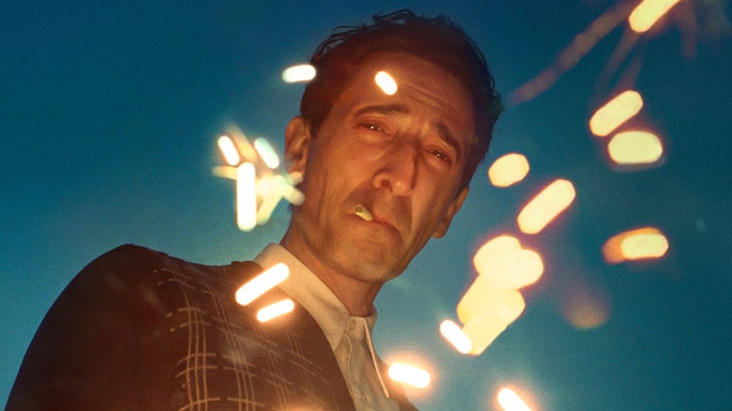
This is why we should honor those who do find a way to put themselves out there, especially if they can do something new and innovative. It’s also why I am absolutely flabbergasted that Emilia Pérez is nominated in tonight’s category, Cinematography, and not something like Nickel Boys. If you’ve seen both films, you know exactly what the problem is here. I’ll get to Pérez in a moment, but how do you just ignore a movie that effectively shoots the entire thing in a first person perspective? It’s not the first project to try out the gimmick, as flicks like Hardcore Henry garnered mainstream attention, but this was the first to really shine and make it more immersive than just a POV. The point is to make the trauma that the two leads go through feel palpable, like you’re experiencing it with them. Even when the movie cheats a bit by having two-way conversations shot by having the actors look at one another, it’s still effective, because you’re making eye contact and participating in the dialogue.
To say that something like Pérez is more deserving of praise for its camerawork is to undercut and contradict the very message its stars and defenders are making, as well as those who are more well-meaning. Someone like RaMell Ross did pick up a camera and attempt to make something new, and his work was essentially ignored (the film is up for Best Picture, but outside of that is only nominated for Adapted Screenplay) in favor of a project that relied almost entirely on Netflix’s massive marketing budget to get the most nominations rather than any merits it might have.
This isn’t the only example, but it is arguably the most egregious. There were several films that made absolutely brilliant use of the lens, and yet all of them were left off. You had movies like We Grown Now and Blitz, which dealt with child protagonists and cleverly kept the camera at their level throughout, so we could see things from their perspective. The Bikeriders made incredible use of cameras mounted to motorcycles. Civil War, a movie literally about photography, framed its shots in strategic ways to reveal crucial information and capture powerful images as if the camera itself were an embedded war correspondent. Then, of course, there’s something less traditional like Heretic, where playing with what we can and can’t see was part of the larger death trap. We even had two movies that dealt with the behind-the-scenes workings of live television – September 5 and Saturday Night – where the camera is an active participant, moving along with the cast in time with the fast-paced operations they have to manage.
I’m not saying the candidates we have don’t offer anything, but I am saying that it felt like the Cinematography Branch just phoned this one in. So much great work was basically pushed aside in favor of entries that feel, well, kind of ordinary by comparison. Very little is truly memorable, and even less stands out as taking the craft in any new or exciting directions. A lot of it still works, but I can’t shake the feeling that we’ve been shortchanged this year, with only two of the finalists rising up to meet the challenge. Be it in positive or negative terms, we’re told to grab a camera and tell our stories to the world, and yet this group largely implies that those who did were dismissed as soon as Netflix’s checks cleared.
This year’s nominees for Cinematography are…
The Brutalist – Lol Crawley
When it comes to the photography, really all the technical elements of The Brutalist, the goal seems to have been to echo the architectural style that inspires the film, namely function over form or flash. A good portion of the shots are framed and lit in a traditional and competent manner (with a few special ones that, in hindsight, feel like they were made more for the trailer than the story), keeping conversations intimate and vistas appropriately impressive. That latter point is best illustrated in two separate scenes, the first being the hike that Harrison takes his friends on to see the top of the hill on which László will build the vaunted community center, and the second being the massive looks at the marble mines that Harrison and László tour late in the film. We also get some cool, shadowy contrast shots as they walk around inside those mines. These moments do serve the overall thematic presentation, as well as granting a sense of scale to László’s creative process and artistic vision.
But really, the aspect that stayed with me after I finished watching was the almost ground-level photography of various vehicles traveling down roads. Throughout the course of the film we see several transitions where beat-up trucks drive down dirt paths and fancier cars cruise finer pavement almost from the POV of the front bumper, peaking with the train derailment that temporarily scuttles the entire building project. These sequences combine admirably to show the steady rise of László’s profile and ambitions, as well as a catastrophic downfall that threatens to destroy him through no fault of his own. It’s a very small part of this 3.5-hour epic, but it perfectly illustrates the tenuous nature of life for migrant workers attempting social mobility, and in a year where this category is sort of hurting for superlative quality, I’ll take what I can get.
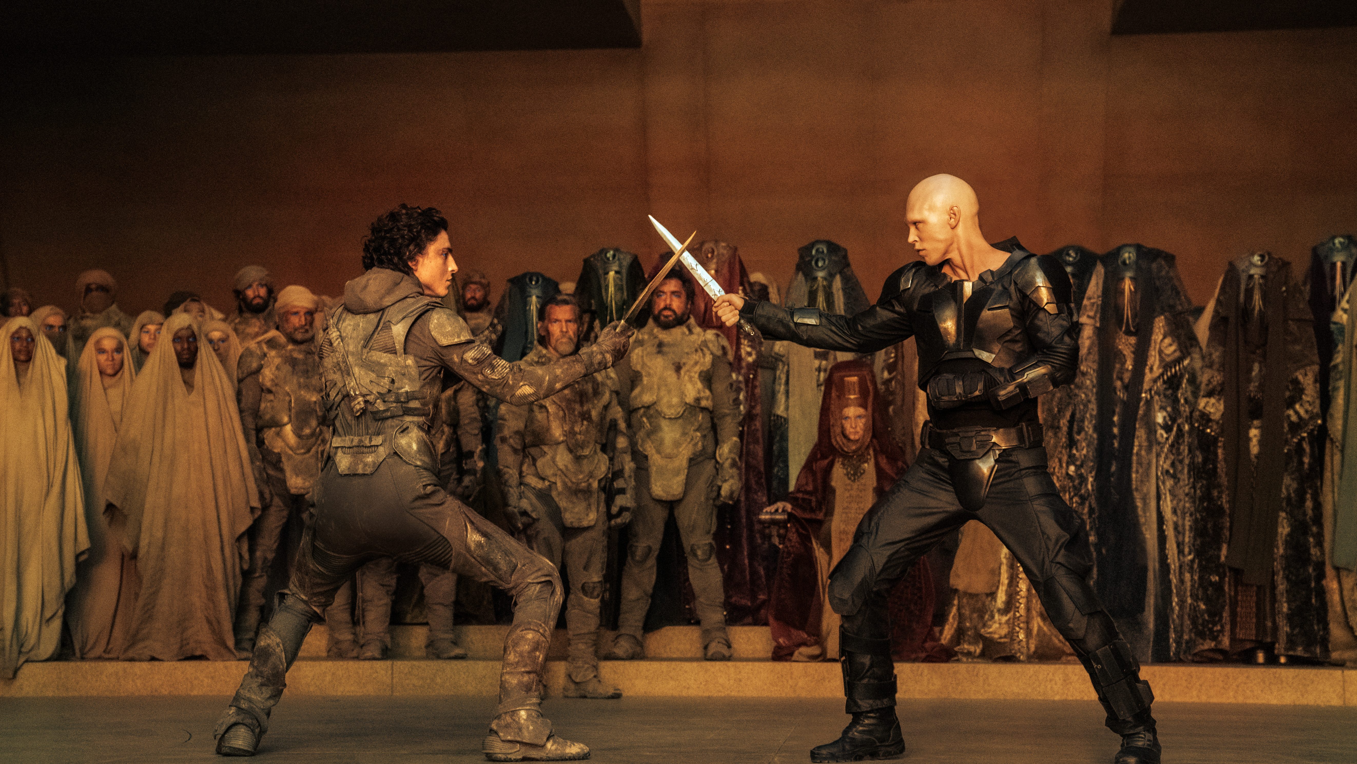
Dune: Part Two – Greig Fraser
Stop me if you’ve heard this one before, but Fraser, who previously won this award for the last Dune, returns this time around in hopes of a repeat. Like last time, his major contribution is establishing the size and scale of Arrakis relative to the characters, and just like last time, he does a fine job.
The major difference here is that there’s more of an emphasis on human contact. It’s not just about showing how big the sandworms are compared to Paul Atreides, it’s about showing Paul riding one. It’s not just about showing a massive crowd of people going into battle, it’s about showing Paul, Chani, and Stilgar leading them, be it with words or actions. It’s not just about showing how ruthless the Harkonnens are to their enemies, it’s about showing how ruthless they can be to each other. Despite the massive dimensions of this world, the task isn’t to demonstrate that vastness, but how it can be adapted to, even controlled and tamed to a certain extent. The first movie was about the wider universe, this one concerns the reality of life within it on a much more personal level.
That doesn’t mean that Fraser still doesn’t have fun with the disparities. The Fremen assault on the Harkonnen spice harvester is one of the best action sequences of the year because the camera keeps that David vs. Goliath proportion firmly in center frame. We see how Paul, Chani, and the others flit around like bugs to the massive machine, and yet still bring it down through advanced tactics. As Paul’s influence grows and the messianic legend of Muad’Dib becomes almost mythic, Fraser makes sure we see just how many people he’s won over in his exile, the crowds growing almost exponentially with each passing victory. And yet, there’s still room for some very close quarters, particularly Paul’s duel with Feyd-Rautha and the latter’s seduction at the hands Lady Margot.
Speaking of Feyd-Rautha, I’d be remiss if I didn’t bring up the best cinematic trick up the film’s collective sleeve. I mentioned this as part of the Visual Effects breakdown, but it bears repeating here. The arena fight between the Harkonnen scion and the remnants of House Atreides is one of the few genuinely creative exercises in cinematography we got last year. Shot in 110-degree heat, Fraser used a special infrared camera to film the scene (which took about a week) in such a stark black-and-white that the whole thing feels like a fever dream of cold-hearted binarism. As I said previously, the VFX team had a hand in the final look, but it’s still an amazing and ballsy way to establish a character pretty much entirely through the camera lens.
Emilia Pérez – Paul Guilhaume

I mean, why am I even bothering? Seriously, what do you honestly remember about any of the camerawork in this movie? Most of us were so fixated on how offensive and stupid everything on screen was, that the actual way it was filmed hardly even registered.
The best I can muster to give this ANY credit comes from what is arguably the picture’s worst element – and THAT is saying something – the musical numbers. The movie itself is edited so shoddily that the transitions between songs and real-time moments is clumsy at best, but Guilhaume does at least try to smooth over the very rough edges in a couple of ways. The first is through relatively fluid blocking of the background dancers and extras, keeping the camera moving in a manner that lets them enter and exit without interference. The second is to use more dynamic lighting schemes during these sequences. Strategic spotlight placement, brightly-colored gels (particularly red), and a somewhat seamless dimming of the backlights while shifting to the key do help to set the mood of each number and inform the audience that we’re taking an aside. It’s functional, and there aren’t any glaring errors, which is the highest compliment I can pay.
Beyond that, this is a case where the production tried to mimic Chicago by using the camera and edit booth as the main choreographer. Quick cuts, pans and swivels, and static shots that jolt back and forth in dolly zooms try to create the illusion that the camera itself is one of the dancers. Unfortunately, the substance of these numbers is so empty and the characterizations so awkward that the result is more akin to Cats, where people I don’t care about prance around for no reason and spout nonsense. That’s not a dig at the Spanish language, mind you. What I’m saying is every time Zoe Saldaña denounces corrupt men through song while on the payroll of a murderer, or how excited she gets at the idea of Adam’s Apple reduction, I start to think that idiocy like “Jellicle” and “Rumpleteazer” is closer to Shakespeare than this dreck is to entertainment or poignancy.
Maria – Edward Lachman
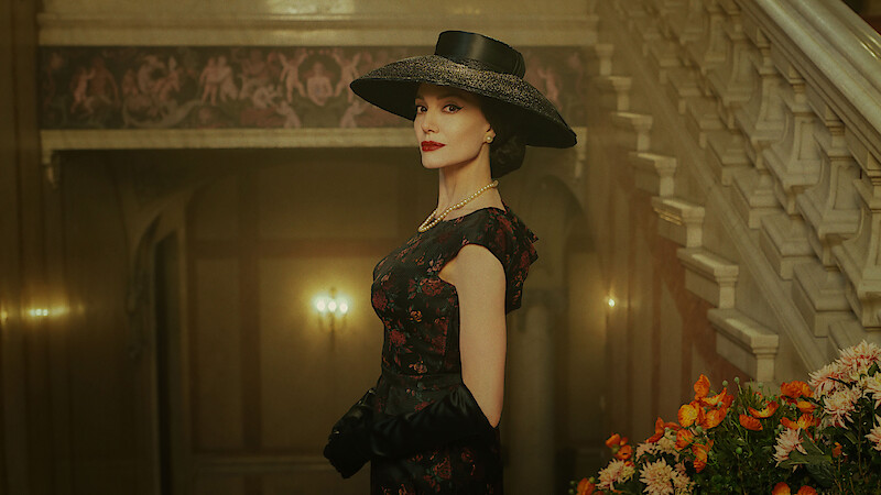
I have to be honest. This feels like a legacy nomination. Ed Lachman has had a long and storied career, working on everything from Less Than Zero to Erin Brockovich, but he has yet to secure the industry’s top honor. This is his fourth bite at the apple, after previous nods for Far From Heaven, Carol, and El Conde last year. This is his second consecutive film under the direction of Pablo Larraín, but Maria has none of the artistic photography of last year’s surprise candidacy.
Like the other films in Larraín’s trilogy of fashionable 20th Century women biopics, Maria is shot in a very straightforward manner. Tracking shots slowly accompany the actors as they walk along a scene, wide shots establish setting only to get in closer for the interior action, and conversations are pretty much in center frame. It’s all standard-issue stuff you learn in your first A.V. class.
There are exactly four motifs Lachman uses here that stand out, but only one of them is really noteworthy in a good way, that being the running gag of Maria Callas’ butler Ferruccio constantly having to move a grand piano about the mansion to appease her whims on a given day. It’s literally breaking his back, but because of his fierce loyalty and devotion, he does it largely without complaint. There are scenes where the camera follows along with the shuffling, working its way around the set piece and the actor, while other times the lens serves as an omniscient fly on the wall. It’s not exactly inspired stuff, but it is somewhat unique.
The other three are tired bits we’ve seen plenty of times before. The film is set in the final week of Callas’ life in 1977, but there are several flashbacks to her earlier days. Those scenes are contrastingly shot in color for the movie’s “present” and black-and-white for the past. It might work, but since the whole thing takes place at least 47 years ago, it has no impact. Secondly, when the film is in color, the palette is all messed up. You see this a lot in the exterior shots as Callas strolls about Paris, where just like Megalopolis, there’s this sickly yellow-orange gradient that covers every scene. I think it’s meant to symbolize the sunset of her life, but in practice it just looks like someone peed on the lens. Finally, and most bafflingly, there are multiple takes, especially in the first act, that are simply wide shots of the opulence of Callas’ home, with the camera very slowly zooming in and out of a doorframe. I have no idea why they’re there, which makes their overt nature even more jarring.
I’m sorry. I really like Lachman’s work most of the time, even if I don’t care for the overall movie, but this is just not up to snuff. It feels like the Cinematography Branch is trying to pull a Diane Warren here, nominating him on his reputation in hopes he’ll finally win as a career achievement rather than for anything special he did in this movie.
Nosferatu – Jarin Blaschke
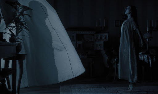
Finally, something worth celebrating. Blaschke has served as the Director of Photography on all four of Robert Eggers’ feature films (he was previously nominated in this category for The Lighthouse), and this may be his best and most experimental work to date. Like his cinematic benefactor, you can tell that Blaschke understood from Day 1 that the most important part of this centennial remake was to create something that had the original Nosferatu‘s audacious feel, but went in its own direction. The best way to homage the unauthorized adaptation of Dracula was to make sure it wasn’t the same.
Blaschke accomplishes this mainly through the lighting and color palette. While the film is entirely in color, the lights (with dark blue gels) are strategically placed to create shadow play that simulates black-and-white by leaning in to a dark, dreary nighttime aesthetic. Orlok is a creeping terror, a nocturnal predator, and a virulent disease, so the mood has to be set by the camera to make the night feel inescapable. Even scenes that for all intents and purposes take place during the day are given this treatment, just a tad brighter. It reminded me, of all things, of Batman: The Animated Series, because in a sense, they tread similar ground. That version of Batman lived in the shadows, operated on stealth just as much as he did brute force, and did the vast majority of his derring-do after the sun went down. “I am the night,” as he famously put it, because it was his closest ally, a tool he used to intimidate the rogues of Gotham. In the rare instance of a daytime scene, sure there was light, but it was always muted and dreary.
The way Orlok stalks is in the same vein. By necessity, he must thrive in darkness, as the original film was the one that established the trope of sunlight being fatal to vampires, and Blaschke and Eggers adhere to that rule. So within the endless night, every step is taken to create a bleak and morbid atmosphere, bathing every scene in gothic overtones while still allowing for the faint glow of candlelight to offer the hope clarity, absolution, and salvation. This all culminates with the masterful recreation of Orlok’s shadowy claw casting a pall over all of Wisburg upon his arrival.
By contrast, the scenes that require more light are cranked up to 11 to create a blazing spectacle, both figuratively and literally. When rooms are fully illuminated, like the Harding house, everything is deceptively bright and colorful, almost to an artificial degree, because it’s but a respite from Ellen’s torment at Orlok’s hands. The hues correspond to the level of her sexual arousal, presented as hysteria for the repressed Victorian-era society. As her internal fires burn hotter, so too does the scenery, eventually erupting in flames, and Blaschke’s lens spares nothing in capturing it all. Orlok’s influence spreads like a plague, and the only way to counter it is with an equally aggressive inferno. This is foreshadowed when Thomas sees the Transylvanian villagers use a parade of torches to hunt and execute a buried vampire, and it comes to full fruition in the climax. Blaschke makes sure we take all of this in, not just because it’s awesome imagery, but to mentally prepare us for all that is to come.
***
Okay, so my feelings here should be obvious. Cinematography is often one of the more fascinating categories of the ceremony, because you get to see just how amazing the craft of filmmaking can be. What can a lens capture that will elevate our experience beyond simply watching actors read dialogue and perform physically? What clues does the director give us about the overall story? What scenes merely look cool, and which ones become indelible? That’s how this usually plays out, but not this year. Two of the entries beggar belief by their very presence when you consider what was left out, one has fits and spurts of greatness in an overall functional presentation, and two actually live up to their billing. It’s just a question of whether you go for what’s already worked before but is taken to the next level, or a novel visual profile masked in a loving tribute. For me, it’s almost literally no contest.
My Rankings:
1) Nosferatu
2) Dune: Part Two
3) The Bruatlist
4) Maria
5) Emilia Pérez
Who do you think should win? Vote now in the poll below!
Up next, we’ve just discussed how the photographer captures the overall vision of a film, so it only makes sense to follow up with the people who actually conceive those visions. It’s Best Director!
Join the conversation in the comments below! What images stuck in your mind from last year? How much does lighting and coloring affect how you view a film? Have you ever picked up a camera and then immediately though, “Okay, now what?” Let me know! And remember, you can follow me on Twitter (fuck “X”) as well as Bluesky, and subscribe to my YouTube channel for even more content, and check out the entire BTRP Media Network at btrpmedia.com!

2 thoughts on “Oscar Blitz 2025 – Cinematography”