With a name like “Production Design,” it would sound like this would be a catch-all category for all the technical elements of a film production. But really, that’s what Best Picture is supposed to be for. The producers get that award for the best overall production, ostensibly. Production Design, on the other hand, is a more generic term for what used to be called Art Direction.
It’s a combination of elements that sets the overall direction for the visual design of the film in general, but it also specifically honors the set designers. Over the last few years, this has also sort of incorporated visual effects, as there are plenty of films these days that don’t use physical sets, but elaborately designed CG sets, or a combination of the two. Recent examples of winning films that bridge this gap are Hugo, Avatar, and Alice in Wonderland.
Strictly speaking, the award is supposed to recognize achievement in “interior design,” but even that isn’t a hard and fast requirement, as recent winners like Mad Max: Fury Road and La La Land have a great deal of superlative outdoor set constructions as well. The way I’ve always thought about it is to think about the overall “look” of the film. Can you immerse yourself in the world you see, the world that’s presented to you? If you can, that’s the sign of good-to-great production design. If you can’t, well, you’re probably in a Michael Bay movie.
This year’s nominees for Production Design are:

Black Panther – Hannah Beachler (Production Design) and Jay Hart (Set Decoration)
More than any Marvel Cinematic Universe film, Black Panther had to blur the line between futuristic tech fantasy and the real modern world. On top of that, they had to create a completely fictitious, but still believable African country, rich with its own traditions and tribal history. And they succeeded at the highest level.
I think the Wakandan palace exemplifies this best. The main hall is meticulously designed with wood cuts, statues, furniture, and other props that you could imagine would populate a modern African stately hall. And then, just beneath that, is Shuri’s lab. With vibranium mines in the background, she uses Wakanda’s main resource to design technology more advanced than anything on earth, in an almost living, breathing workspace that responds to her every need. And of course, just to cap it all off, the whole thing is embedded in rock with cool artwork on the stairway down. It takes an amazing level of design skill to pull off such extremes. Throw in other gems like the Korean casino, the Wakandan fields, and even the project housing in Oakland where Killmonger grew up, and you’ve got what has to be considered a front-runner.

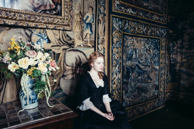
The Favourite – Fiona Crumbie (Production Design) and Alice Felton (Set Decoration)
A lot of the hard work is already done for you when you’re designing a period costume drama. The subgenre has been done so many times that you can almost make a checklist of things you need: tapestries, ornate furniture, shrubberies, objets d’arts, etc. Not only did the film have all of these elements, it even enhanced some of them, like the tapestry secret door in Queen Anne’s chambers.
Where the team for The Favourite does its best work is in making the most out of the large and small spaces at their disposal. Abigail is able to stealthily find her opening into Anne’s good graces by hiding in plain sight on the higher library balcony while Sarah seduces Anne below, for instance. That scene alone requires a vast amount of props and set pieces to make this wide open space seem as real as possible. Not an inch of wall can remain uncovered. Similarly, in more tight spaces like the kitchens, there are a lot of people working on different things in a more intimate setting, so the designers and decorators have to crowd the proceedings even further with cumbersome dishes, tables, and counters. Essentially, in the big spaces every prop is a potential weapon in Abigail’s arsenal, and in small spaces everything is a physical obstacle. It’s a great juxtaposition.

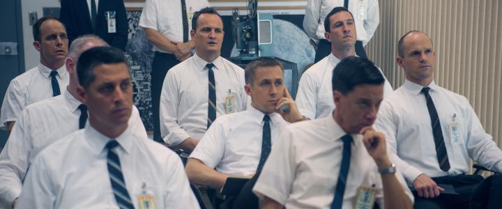
First Man – Nathan Crowley (Production Design) and Kathy Lucas (Set Decoration)
It’s a bit ironic for a movie about going to the moon, but the real challenge of First Man is how much can be packed into such tiny bits of space. Not only does this foster an intimacy with the cast of astronauts, but it creates claustrophobic drama when anything goes awry. Apart from the grand moment when Armstrong and Aldrin actually set foot on the lunar surface, the design of this movie is all about the little things.
Thankfully, the team is well up to the task, mostly because Nathan Crowley is old hand at this sort of thing. This is his fifth nomination, and second in a row (last year he was up for Dunkirk), and his second nomination for a space film (Interstellar). The cockpits of every rocket are filled to the brim with buttons, dials, and levers, accurately recreating the real-life pilot areas of the nascent space program. Similarly, the training areas at NASA are dank and spartan, leaving little space for the crews to maneuver around one another. And of course, when you’re in government housing, particularly living on base, the houses are modest and small, with minimal accouterments. It’s all in service to the minimalist nature of Armstrong as a person, as well as the extremely dangerous situation he and all the others were in at the time.
Mary Poppins Returns – John Myhre (Production Design) and Gordon Sim (Set Decoration)
This is sadly yet another area where this film suffers from the attempts to mimic and recreate its predecessor. It’s hard to give too much credit to the set designs when the Banks home looks just like it did 50+ years ago, same with the Fidelity Fiduciary Bank.
The two true bits of originality come in the form of one-off musical numbers. For the purposes of a song and a bad pun, Topsy’s upside-down house is a very creative bit of design. Also, within the animated world of the Royal Doulton Bowl, the stage where Mary and Jack perform is a wonderful blend of animation and live action, painted and built like a living cartoon, just like the children’s outfits. I don’t know why they thought Mary Poppins needed to look like a pink-suited version of Catherine Zeta-Jones from Chicago for the scene, but it’s forgivable.

Roma – Eugenio Caballero (Production Design) and Bárbara Enríquez (Set Decoration)
It’s interesting to see this film nominated in this category, not because there aren’t any sets or anything, but because by the very nature of the film’s central conceit – paying attention to Cleo and what she reacts to – we’re basically not supposed to notice them. It’s also just a bit harder to see with black and white photography.
That said, there are some pretty interesting set designs. The family home is well-decorated. The rooftop area is a lovely little area of clotheslines and TV antennae. The hunting lodge is nice as well. Really, the best bit of set design is actually the street outside the family home. There’s always something interesting positioned there, either a parked car, or a sign, or a marching band walking by. It’s a bit weird to think of people as set decoration, but in those moments, that is their exact purpose. They’re living window dressing. It’s not what one would traditionally think of in this context, but it’s highly creative nonetheless.
* * * * *
My Rankings:
1) Black Panther
2) First Man
3) The Favourite
4) Roma
5) Mary Poppins Returns
Next up: Only two categories remain, and before we get to the big one, there’s one last little one to handle. It’s Live Action Short!
Join the conversation in the comments below! Which film gets your vote? What designs stick out to you? What would you create in Shuri’s lab? Let me know!

One thought on “Oscar Gold 2019 – Production Design”