It’s somewhat appropriate that I’m handling this category tonight. Part of the focus is on set design, and today I started on set with my latest job, mostly watching the technicians and builders put the set together so we can start shooting tomorrow. It’s what we call “synergy,” folks.
Anyway, as I am not a visual artist in any way, I would never be qualified to properly design a set. I tried years ago when I was temporarily the drama coach at my old high school (play got cancelled due to copyright issues), and the best I could do was come up with relative concepts in hopes that my stage manager and the shop class kids could make it work. I was trying to put on The Philadelphia Story, and the entire show happens either inside the main family’s house, or on their front porch, so the idea was to have a three-panel set that I could spin around without having to paint scrims and backdrops or have the stage crew constantly moving props (I had them double as the house staff so they could carry stuff and do some shtick in between scenes while setting the stage; if you’re going to see them, might as well let them be part of the show).
If I’m being perfectly honest, it probably would have been a disaster if we actually tried to execute the vision. Again, I know my limitations. But the people who create the look of great films are truly inspiring. I think I mentioned it last year, but the winning Production Design for Once Upon a Time… in Hollywood was something that bordered on interactive for those of us living in Los Angeles, as pretty much all of downtown was retrofitted to look like the late 60s. It was a trip to drive through it whenever they weren’t shooting, and the setup lasted for months. Meanwhile, today it took myself, two other producers, and three stagehands to decipher the floor plan to set up the table where I’ll be sitting backstage.
So yeah, I’m not exactly an expert on this area of a production. But I know what’s pleasing to the eye, and I know what’s functional within the context of a movie. And of course, being an expert is NEVER the point on this blog, just semi-professional enjoyment and appreciation. So let’s pick this shit apart!
This year’s nominees for Production Design are:
The Father – Production Design: Peter Francis; Set Decoration: Cathy Featherstone
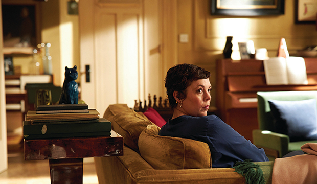
If there’s a criterion that I prioritize more than anything else when I look at this category, it’s utility. Just like the way out of his depth drama coach I was at 22, I want the set to have a function. That doesn’t mean looking pretty can’t be enough, especially if it’s well-appointed. But I always look at what you do with the sets just as closely as I look at the general aesthetic. And of the films nominated here, The Father is arguably the most utile of the bunch.
For all intents and purposes, the design is very simple. The main set is a just four-room apartment. It’s a bedroom, bathroom, living room, and kitchen. That’s it. But the magic is in the subtle changes that happen to that simple design throughout the film. A piece of artwork comes on and off the central wall in the living room. Couches get replaced with armchairs. The shower curtain changes. Depending on when Anthony Hopkins is sleeping, the bedding is different. The bar and stools in the kitchen get replaced with a lower dining set with chairs. From moment to moment, something is different about Anthony’s surroundings.
This is a near-perfect way to represent the confusion and paranoia associated with Anthony’s dementia. Basically every time he turns around, something is different or out of place. It’d be enough to drive anyone up a wall and make them question everything around them. When that anxiety is compounded by your loved ones matter-of-factly telling you information about the here and now that feels contradictory to what little you still know, it would be beyond distressing.
This is what I’m talking about when I say that what you do matters just as much as how it looks. On its surface, this is such a basic design, but to use that basic nature in such a way as to visually convey a descent into madness? That’s inspired.
Ma Rainey’s Black Bottom – Production Design: Mark Ricker; Set Decoration: Karen O’Hara and Diana Sroughton

This is another entry that does a lot with what is seemingly very little. For the vast majority of the film, there are two sets: The studio where Ma Rainey and her band record their music, and the “band room” a floor below, where Levee and the others hang out, practice, and basically wait until they’re called up to work. Attached to the studio is the actual recording booth, elevated via staircase so that it can look out on the entire studio.
That’s a great visual metaphor. This is literally segregation in action. The white men trying to make money off of Ma’s talent are in the highest compartment, looking and speaking down to the black people doing the work, and ultimately deciding if the recording is “good” enough to move on to the next song. In the middle is Ma, who is tolerated because of her talent and profitability, so they give her some slack, but they make sure not to be in the same room with her or make physical contact. And then below her are the plebs, who might as well not even have names for as much as the people in charge give a crap about them, which of course becomes central to Levee’s tragedy.
The two main rooms are sparsely appointed, which further serves the musical apartheid. The studio has a few armchairs and a couple working fans to make the space somewhat tolerable on such a hot Chicago day, but there’s certainly not enough comfort to go around, and when it’s time to record, even the windows get completely shuttered, making it sweltering in there for half a dozen people to try to do their work without their tempers overheating with the room. Down below, it’s even worse, with just a few lockers, a practice piano, and a bench. They have one ceiling fan, but it doesn’t work properly, and the whole time, there’s this separate door that apparently leads outside. It taunts them, because it won’t open, so no air can be let in, and it also prevents the hot-blooded Levee (or anyone else) from being able to step away from the escalating tensions.
Mank – Production Design: Donald Graham Burt; Set Decoration: Jan Pascale
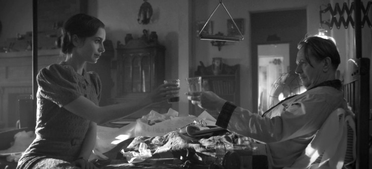
Much like Once Upon a Time… in Hollywood, the fun with this design is in the nostalgia and the homage. It’s being able to feel like you can participate in the film as you watch, and for nerds like me, this is a lot of fun.
Tarantino’s team redecorated downtown Los Angeles. David Fincher’s team is tasked with creating sets that either evoke the classic Hollywood era, or reference Citizen Kane directly. The cabin where Mank recovers from injury while writing the script is meant to make you think of Kane’s deathbed on the inside, and Leland’s retirement home on the outside. The studio lot is designed to resemble the hustle and bustle of Kane’s first newsroom. This goes for Mank’s writers room as well. Inside San Simeon, the massive fireplace in the dining hall is almost an exact replica of the cavernous fireplace in Kane’s Xanadu. There are a ton of these Easter Eggs scattered throughout the film.
But even for the bits that aren’t references, the intent is create an air of wistfulness for a bygone era, and the design team succeeds spectacularly. In particular, I think of the fountains and zoo at San Simeon and the old movie set where Mank and Marion Davies have a casual chat while she’s tied to a post on top of what is soon to be a burning pile of wood. Professionals and stagehands flitter in and out, positioning lights and cameras, extras walk about in costume minding their own business, and producers sit around on dolly carts. Hollywood may be self-indulgent to the point of nausea at times, but one of the touches I always love is when they show the world how the sausage gets made and gives a look behind the scenes of movie production, even when that look is 100% staged and there’s yet another crew behind the camera capturing all this. I’ve always gotten a sense of meta joy out of it.
News of the World – Production Design: David Crank; Set Decoration: Elizabeth Keenan

The best parts of the design for News of the World don’t come from the interior sets. For the most part, those cabins are cramped and poorly lit. I still enjoy hearing Tom Hanks deliver the “news” in these moments, but I’m only paying attention to him, not anything that might be around him. It’s the outdoors where the design team shines the brightest, because we can get both a sense of wonder at the great wide open as well as some degree of intimacy for the characters. There are some people who believe that this category should be limited only to the indoor areas, but after last year’s winner, we should all put that theory to bed.
When Kidd first comes across Johanna, that’s a special moment, because of that open closeness. Her wagon’s been attacked, her driver lynched, and she’s alone in the woods. Conceivably, she could have run anywhere, but she stayed at the scene, leading to her eventual discovery. As such, we in the audience get to truly take the moment in, and absorb the scene as if we’re right next to Kidd himself. That’s a moment where the scene feels alive.
Similarly, when the pair are chased down by Almay and his crew towards the end of the first act, the fight happens out in the open on a rocky hillside. That’s where the best design happens, because the crew has to use the space efficiently and create false stones for cover in the natural environment. There’s a great combination of outdoor construction and real-world elements to create an intense action scene. Of this group, the sets here are probably the least distinct, but the creation of those two scenes stuck out to me when I first saw the film.
Tenet – Production Design: Nathan Crowley; Set Decoration: Kathy Lucas

We’ve seen Nathan Crowley’s name on this list before, as he’s on his sixth nomination in this category, though he’s yet to win, despite excellent work on Dunkirk, First Man, and The Dark Night. Dude’s been working with Christopher Nolan for close to 20 years now, and he definitely has the motif down, particularly the use of steely blues and greys for the color palette.
Many of the sets in this film are memorable due to character moments and action sequences that take place within them. The film opens in a massive opera house. The villain, Sator, has a distinctive boat where he does a lot of his evil plotting. The Protagonist gets into the first major hand-to-hand fight in an airport art vault, where the hallways are narrowed to just the perfect amount of space for some pretty outstanding stunt choreography.
And then, of course, there’s the pièce de résistance, the turnstiles. What a fun concept. The idea that you can step into what honestly looks like a larger version of a dark room door in a photography lab, then have it spin you to the other side, and you come out as the inverted version of yourself, and time goes backwards, is just so wonderfully bonkers. It’s such a simple set piece, but its use is one of the central premises of the entire flick, and given the amount of exposition and technobabble the film can have at times, it also becomes one of the easiest bits to believe despite the far out idea of it all.
***
Of all the artistic and technical categories, this one might be the most stacked. There’s not a bad entry here, and while I personally would have nominated Promising Young Woman here instead of News of the World, all of the candidates have an argument to win. This is another one of those categories where I won’t be upset at any result come Oscar Night, and my overall ranking is basically A+ to B at worst.
My Rankings:
1) Mank
2) The Father
3) Ma Rainey’s Black Bottom
4) Tenet
5) News of the World
Who do you think should win? Vote now in the poll below!
Next up, one of the few times a pre-determined outcome is actually for the best. It’s Best Actor!
Join the conversation in the comments below! What did you think of these films? Have you ever tried to design a set? If you were inverted, how far back in your life would you go before resuming normal time? Let me know!

One thought on “Oscar Gold 2021 – Production Design”