I would never characterize any Oscar category as “boring,” because no matter what the discipline, the field is full of dedicated professionals and artists doing the best job they possibly can. But some are more expansive than others, creating legitimate intrigue and suspense year in and year out as to who might be nominated or win. In most categories, you’re never quite sure what the sensibilities of the nominating branch are, or where the winds will blow with the entire Academy voting for the final award.
Costume Design, however, is not that. Again, I’ll never call it “boring,” but it is probably the most rote of the Oscar fields, with the most predictable outcomes. Most of the time the various candidates fall neatly into one of three areas:
Period Pieces: This is where you get the vast majority of winners over the last few decades. Apparently the Costume Designers Branch, as well as the Academy as a unit, have a massive hard-on for Elizabethan and Victorian dresses and court outfits. Even as we move further and further into the future, the period fetish simply updates itself, with more recent distant past eras becoming more fashionable, like the 1920s, 1950s, and 1970s. Basically, as long as the clothing is well out of style, it can be rehashed as “retro” and be worthy of consideration.
Sci-Fi/Fantasy: If you can’t stay in reality, you can make up pretty much anything you want for the purposes of fantasy. This is the one area where mainstream films that are at least tangentially close to the modern day can succeed, as the likes of the Harry Potter series and Black Panther can be recognized. But of course, these films aren’t considered because of the outfits that actual people might actually wear, but for the colorful, outlandish parallel designs that happen to exist in some tucked away sector out of the notice of the rest of the world. On the flipside, you also get a range of space uniforms, medieval garb, and costuming for imaginary creatures and races. It certainly has the widest spectrum of possibilities.
Disney Sequels/Remakes: This is a sort of leitmotif, only existing since 2010, but it’s been so successful that I’d wager anything Disney prioritizes which of their animated classics gets a live-action remake depending on how many different costumes they can make for the express purpose of campaigning for this very award, as if winning it justifies the movies’ existence. Since Tim Burton’s Alice in Wonderland remake won the category, the remakes of Cinderella, Beauty and the Beast, and Mulan have all been nominated, as have the decades-late sequel, Mary Poppins Returns and the “premake” (my term for a prequel/remake hybrid), Maleficent.
It’s so pedestrian at times that it becomes an absolute marvel whenever something truly contemporary gets any recognition. This century, only four films set anywhere near the present day of their release have been nominated: La La Land, I Am Love, The Queen, and The Devil Wears Prada, with that last one being part of a smaller fourth default category not quite large enough to stand with the other three – movies about fashion. If you want to find a winner with the fashion of its time, you have to go all the way back to 1994’s The Adventures of Priscilla, Queen of the Desert, and even then you have to give it something of an asterisk because it was a film about drag queens, so the costuming is intentionally over-the-top.
Why can’t something just look good in a modern movie and get recognized for looking good? Why can’t there be clever costuming choices, where the use of colors and accessories are metaphorical links to the character wearing them, or clues to the plot (in a way that’s not heavy handed, hint HINT, Spielberg)? How is that any less important than the latest set of impractical, flowing dresses? It’s really disheartening how easy it is to see what’s going to get the nominations every single year, and it’s rarely because we’ve seen an actual achievement in the design, but because we know the tropes that the voters key into, and thus can recognize when the costuming is created explicitly for the award as part of its marketing strategy rather than any actual creativity.
Don’t believe me? Just look at our set for this year. We have three period nominees, one sci-fi, and one Disney. And I could have picked them all out of a lineup from the posters. I didn’t need to see one minute of any of these movies to know they were going to get the nominations, because a still image alone could tell me that the productions were gunning for this category. That doesn’t mean the designs are bad, just that there are absolutely no surprises. It’s not quite boring, but it’s damn close.
This year’s nominees for Costume Design are…
Cruella – Jenny Beavan
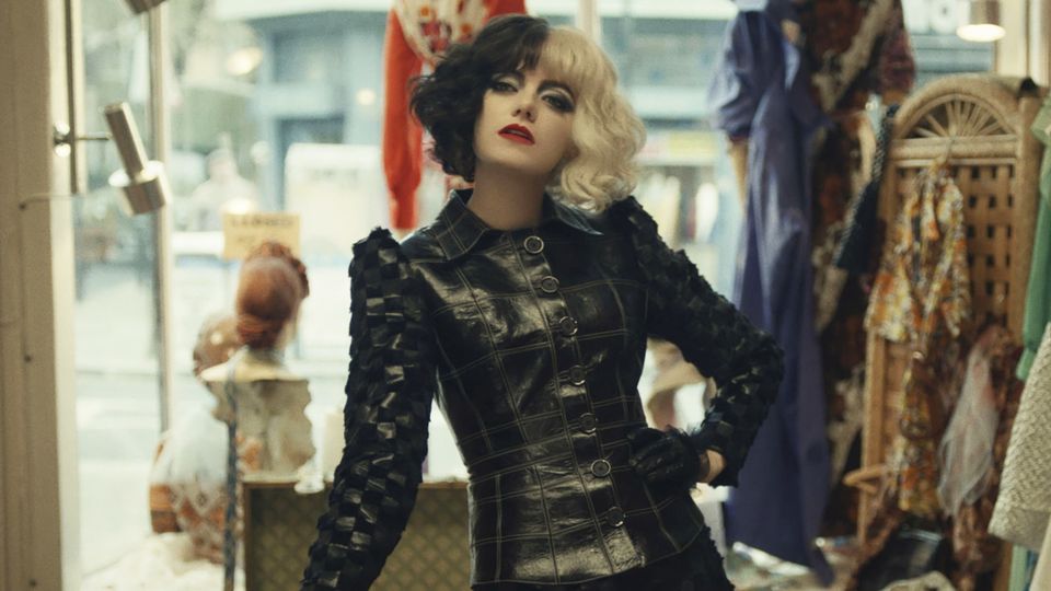
The best way to address this is to quote from my own review of the film. “Disney is obviously trying to wrangle Oscar nominations for costuming and makeup. Given Hollywood’s overall laziness, they’ll likely succeed, which is why I watched the movie now to save myself the trouble next year.”
CALLED IT!
And while I won’t simply copy/paste my entire review, I will note once more that the costumes are butt ugly. There’s no actual design to any of them. The entire film retcons Cruella de Vil into some kind of 70s punk rock fashion iconoclast (even though the story of 101 Dalmatians takes place in the 60s), but there’s no rhyme, reason, or anything to suppress a gag reflex about Cruella’s so-called “outfits.” They look like rejects from a leather dungeon, as if a dominatrix couldn’t use them because it’s hard to be a sadist when you’re laughing so hard. Just because you throw black on everything doesn’t make you dark and mysterious. Half the time it just makes you a poser. I mean, the film itself is telling you straight up how lazy this all is, as Cruella’s first “triumph” involves literally throwing garbage on a mannequin while she’s drunk, and the rest of her empire is built on taking disused clothes from a consignment shop and just stitching them together. If that’s fashion, then Dr. Frankenstein was a cosmetic surgeon! They are arguably the most eye-catching outfits of this field, but for all the wrong reasons. You notice them because they’re constantly thrown in your face, crowding the entire screen so you can’t look away, like Alex DeLarge having his eyelids pinned open, not because they stand out for any noteworthy quality.
And what about the “normal” dresses? Well, they look fine, but that’s mostly because it’s Emma Stone. The red dress she magically doesn’t singe when she burns off her cloak (because fuck physics, am I right?) doesn’t look good because it’s anything special, it looks good because Emma Stone is in a sleek red dress. Emma Stone could wear one of those novelty t-shirts with a bikini drawn on it with Garfield sweatpants and she’d still be the hottest person in the room by a million degrees.
It’s kind of amazing to me that there were multiple films this year that were about fashion, but this was the one that got nominated (though it’s also a very minor element in another down the list). I only bring this up because when the Oscar nominees were announced, the broadcast was broken up halfway through so that Tracee Ellis-Ross and Leslie Jordan could “interview” a “movie lover” that Disney had set up to basically plug all of their nominees, and he specifically cited Cruella as a worthy choice because it was a movie about fashion, much like The Devil Wears Prada or Phantom Thread. Well, if that was a qualifier, then why wasn’t House of Gucci nominated? It’s literally about a fashion house. Or what about Last Night in Soho, which is about a fashion student, retro designs of the 60s, and a creative blending of old and modern looks? Because this time at least, being about clothing doesn’t actually matter. What matters is appeasing Disney and giving them free advertising and campaigning time, which is why this is one of the few “Below the Line” categories that wasn’t cut. Cruella is considered the front-runner, but it shouldn’t even be eligible. If that’s what counts for design, I’m going to start submitting home movies of my mom putting outfits on her old cat.
Cyrano – Massimo Cantini Parrini and Jacqueline Durran
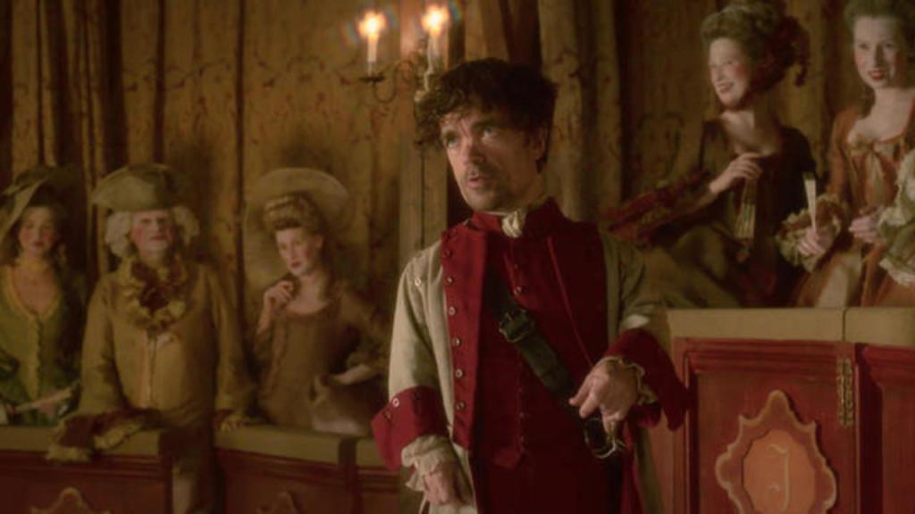
This is just your standard period piece, and honestly, it feels kind of phoned in from a costuming perspective. Only one thing really stands out, and that’s how much the dresses for Haley Bennett seem engineered to have her chest practically falling out. Now, in a vacuum, I don’t mind that, her boobs look spectacular. But just about every period dress does that, so it’s nothing we haven’t seen many times before.
As for the men, they somehow get an even shorter end of the stick. Christian, Cyrano, and just about every soldier in the guard are decked out in these overly baggy rags that make it look like someone inflated balloons in their forearms, but stopped halfway. It’s how I imagine Popeye would look if he stopped working out and his skin started to sag. And look how drab the color scheme is. In the still above, Cyrano’s reds basically blend into the reds of the background sets. Now, if that were some grand metaphor for him intentionally fading from view I’d appreciate that, but he’s front and center for pretty much the entire film, so it doesn’t make a lick of sense.
Honestly, this feels like a pity nomination. The studio campaigned hard for Cyrano to be a major player this Awards Season, but didn’t measure up to even the manufactured competition, so the Costume Design Branch threw them a bone, probably because they realized that they didn’t have a European fancy period dress piece already on their slate. Why they didn’t go with The Green Knight or The Last Duel to fill this box check I’ll never truly know.
Dune – Jacqueline West and Robert Morgan
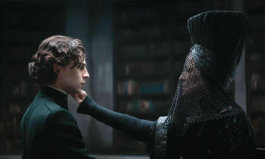
In what may be the most practical bit of costuming in this set, the outfits in Dune go a long way towards establishing the mood of the characters and their relative motivations. The evil Harkonnens wear all black, the good and regal Atreides soldiers wear all white, the actual members of the house are decked out in royal blue and dark, charcoal greys. And of course, the Fremen, who have mixed allegiances and a nebulous role still to play, are clad in middling greys and browns. It’s all very straightforward.
Where the work shines the brightest is in contrast to the characters’ various settings. Not only do the fabrics denote the moral alignment of the players, but scenes are shot with the overall color palette in mind, with Paul blending in to the shadows when he’s moody, or Duncan’s bright armor standing out like the sorest of thumbs to draw enemy attention to him during his final fight. Similarly, the Fremen fade perfectly into their environment, their rags giving them an almost natural camouflage.
This is arguably the one film in this set that uses the costumes in tandem with the rest of the artistic and creative design elements. All the others either make them the centerpiece and expect them to do the heavy lifting for a lacking story and performances, or they’re a highlighted element that neither adds nor detracts from the proceedings, but the director certainly wants you to pay attention to them.
Nightmare Alley – Luis Sequeira
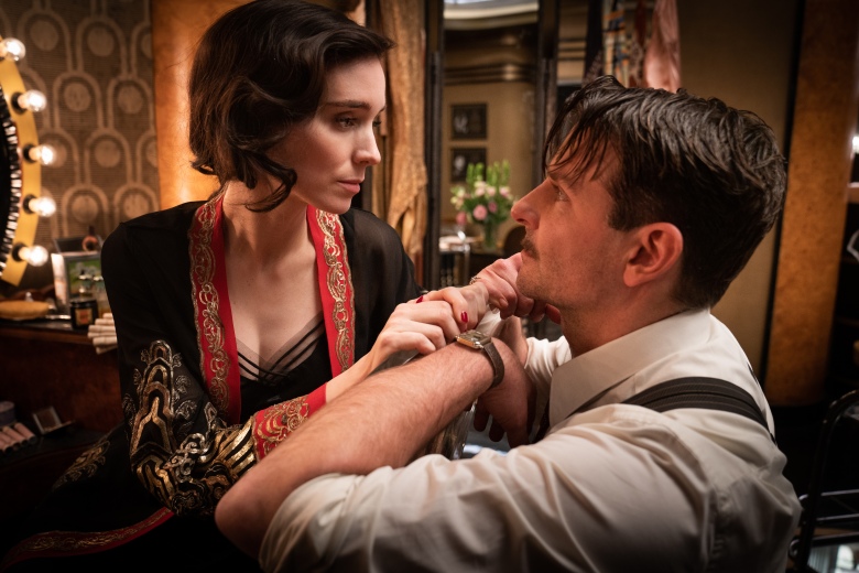
I really do like the costumes here, as they typically match the moods, just like with Dune. However, I rank it slightly below Denis Villeneuve’s blockbuster for two main reasons. One, like many Guillermo del Toro projects, some of the outfits are just weird for the sake of being weird. Two, given that this is a film about carnival performers, the costuming at times feels like it’s part of the illusion, like they wouldn’t be what these characters would actually wear, but what they put on to fool the audience. To an extent I appreciate that bit of meta thinking, but I feel it goes just a touch too far here.
Take Toni Collette and David Strathairn’s characters for instance. They teach Bradley Cooper how to be a mentalist and do cold readings. When she’s on stage performing, Collette wears this really interesting outfit, but it’s just for the show. When the carnies are done for the day, she just chills in a dress and/or nightgown. I get that we’re never the full version of ourselves that we present to the world, and the entire point of the film is misdirection, but this is one of those times where the concept disappears up its own asshole. When you let us in too much on the gag, it becomes pointless. The same goes for the climactic confrontation with Richard Jenkins, having Rooney Mara put on a tattered wedding dress. You’re trying to scare him with visions of a ghost, but this extra bit of spook goes too far, creates too many variables, and ultimately leads to Cooper’s comeuppance. It’d be fun if we couldn’t see it coming a mile away. A little more subtlety would have gone a long way for the overall costuming profile of this movie. It’s still miles ahead of the rest of the field except for Dune, but it could have blown me completely away.
West Side Story – Paul Tazewell
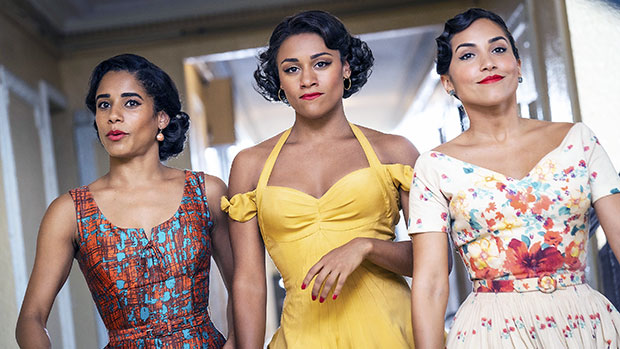
There are basically only two things of note when it comes to the costumes here, and sadly, both feed in to the lesser elements of the film. The first is that when it comes to Anita and the other Shark girls, their dresses are more vibrant, colorful, and flowing. That would be all well and good, but it just gives further lie to the idea that this isn’t a straight up remake. In the original, Anita wore this lovely yet simple lavender dress that moved naturally with her during the performance of “America.” Here, Anita has about three layers on, with different variations of red and yellow (but still with a tight area just below the hips for the gratuitous ass shot), and it’s so big that the foley artist felt the need to amplify the ruffling sound it makes when the ladies throw up the skirts. It’s just Spielberg trying to do the same thing as before, only more, because in his mind that makes it better. No, it just makes it more expensive.
The second area is in relation to the Jets, and this goes to my absolute seething hatred of Spielberg’s decision to take sides in the gang conflict. In the original movie, you could tell the Jets apart based on what they wear. Depending on who you looked at, you’d see white shirts, red shirts, black shirts, yellow shirts, blue jeans, brown pants, black jeans, and khakis among many other varieties. Seriously, watch the clip of the original film’s opening and you’ll see what I mean. Here, the Jets are a monolith, all wearing blue denim and plain white t-shirts, with various alterations and cuts. That’s it. It’s part of Spielberg’s baffling take on presenting the Jets as one-note racist, rapist hooligans with no redeeming qualities while making sure the Sharks are all unique individuals with valid hopes and dreams (Anita and Maria both want to open their own boutiques one day and we even see Anita sitting at a sewing machine in a late scene – there’s your other link to fashion in the group). It’s disgusting. All the nuance was thrown out of the window for what appears to be a disingenuous bout of misplaced social commentary and virtue signaling. That thematic choice ruins a good chunk of the film, and the costuming choices only highlight the sin.
***
My Rankings:
1) Dune
2) Nightmare Alley
3) Cyrano
4) West Side Story
5) Cruella
Who do you think should win? Vote now in the poll below!
Up Next, the Short program reaches its conclusion with some stories so amazing they just have to be true. It’s Documentary Short!
Join the conversation in the comments below! What type of costumes do you like to see in movies? How hard should it be to have contemporary outfits get recognized? Is there a lazier, more predictable branch in the Academy when it comes to their nominations? Let me know!

2 thoughts on “Oscar Gold 2022 – Costume Design”